The Beginnings of the R Observatory

One place to watch the whole R package ecosystem, CRAN and Bioconductor, measured and remembered over time.

r
cran
bioconductor
data
tools
Author

James Balamuta

Published

July 12, 2026

Abstract

The R Observatory grew out of wanting to see what was happening across CRAN and Bioconductor, the two big R package repositories, and wanting to see it in something more modern than the pages they serve today. It is one public place to watch the whole ecosystem, with every package measured across every install channel, its code, licenses, and authors tracked version by version, and the daily life of the archive itself, the submission queue, check results, and archivals. It counts downloads across seven channels instead of one mirror, colors a call graph by test coverage so the untested parts glow red, flags copyleft hiding under a permissive license, diffs any two versions of a package, and follows Bioconductor on its own release cycle. This is an early look at what it already does, and how it sits next to the CRAN mirror everyone quotes, r-universe, and METACRAN.

The R Observatory hex logo: an observatory dome whose telescope tilts up to track a constellation shaped like the letter R.

The R Observatory hex logo: an observatory dome whose telescope tilts up to track a constellation shaped like the letter R.

Two frustrations

The R Observatory started from two frustrations. I wanted to see what was happening across CRAN and Bioconductor, the two big R package repositories, week to week: what was being published, what was breaking, what was getting pulled, and how any given package was really doing. And I wanted to look at all of it in something built this decade, not the pages the repositories serve today.

The usual answer to the first is one number: a package’s download count from the cloud CRAN mirror, the one Posit maintains and whose logs nearly every download badge counts. It is the closest thing the community has to a shared scoreboard, and it barely says anything. It is one channel, blind to the Bioconductor installs and the ones that arrive through r2u and the c2d4u PPAs, conda-forge and bioconda, and Linux distribution builds on Fedora and openSUSE. And it says nothing about the thing being downloaded: whether the code is tested, how it changed in the last release, whether a dependency three levels down is copyleft, or whether the package is one careful decade-long project or a fast-moving group effort.

The signals that would answer these questions exist, scattered across a dozen services in a dozen formats, mostly with no memory of what they looked like last month. Gathering them into one place is most of what the Observatory does. The second frustration, the look of the thing, took a different lesson to learn.

A package page, not a paint job

I have tried to fix CRAN’s pages before, from the outside. A while back I built the CSS CRAN Garden, a stylesheet you could drop in front of CRAN to make its 1990s-era HTML look like a modern site.
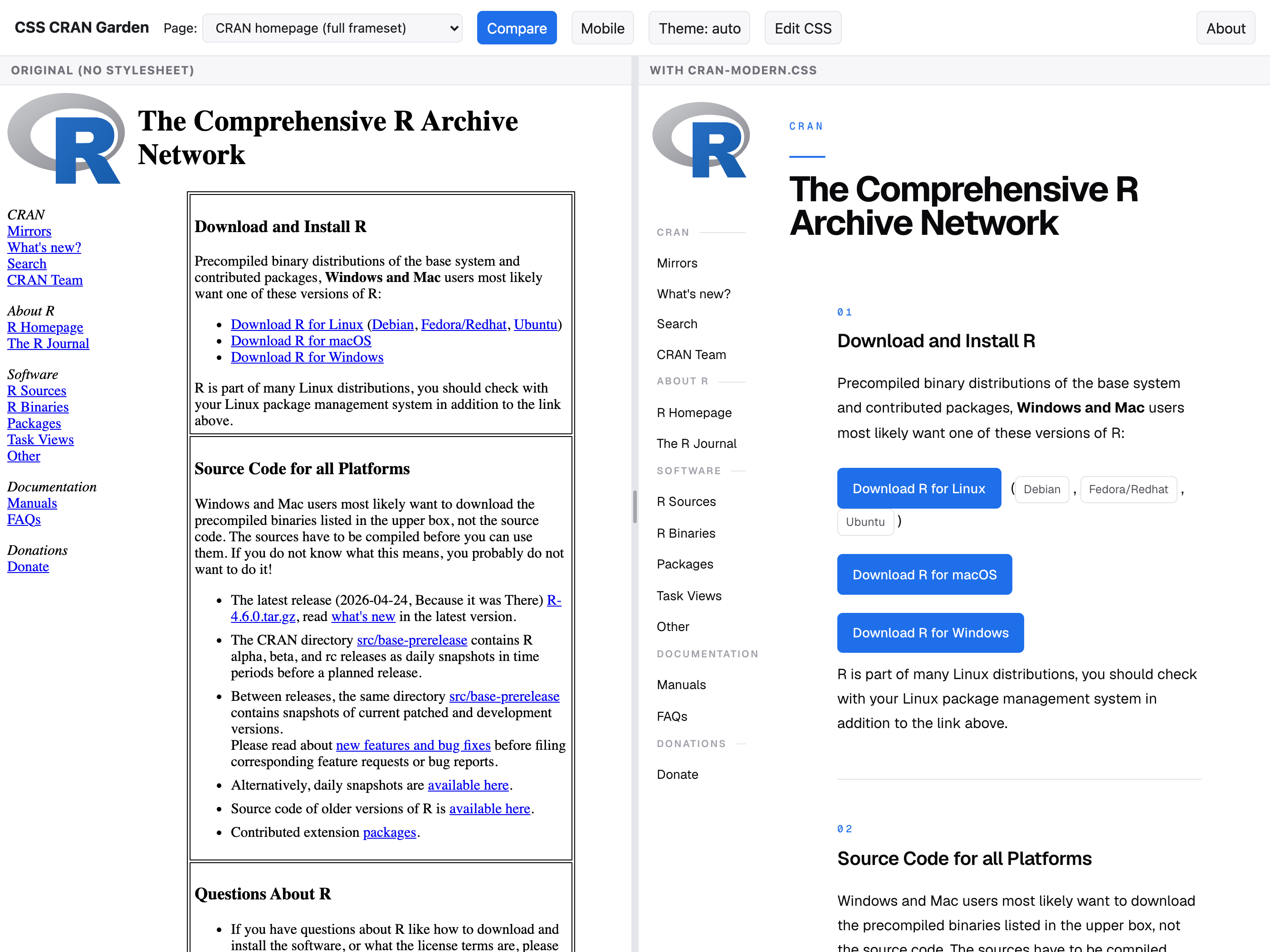
A side-by-side comparison titled CSS CRAN Garden. On the left, labeled 'original (no stylesheet)', the CRAN homepage in its default serif and table layout. On the right, labeled 'with cran-modern.css', the same page restyled with a clean left sidebar, blue buttoned download links, and numbered section headings.

The CSS CRAN Garden: the bare CRAN homepage on the left, the same page restyled by cran-modern.css on the right. Same content, new coat of paint.

It works, and I still like it, but it taught me the ceiling of that approach: a stylesheet can only restyle the bytes CRAN already sends. It cannot add a download trend, a coverage number, or a version history, because CRAN never computed those in the first place. The page looks smarter without being smarter.

The R Observatory is the other half of that idea. Instead of just a reskin it adds analytics, giving anything on CRAN or Bioconductor a package page with measurement attached and, because it keeps a history, the ability to diff two versions of a package and see what changed between them.

Look it up

In practice it is a website you browse, backed by a growing pile of data that refreshes on a schedule. There is no account to create and nothing to install. It is the thing you open when you want to look something up about a package and its surroundings.
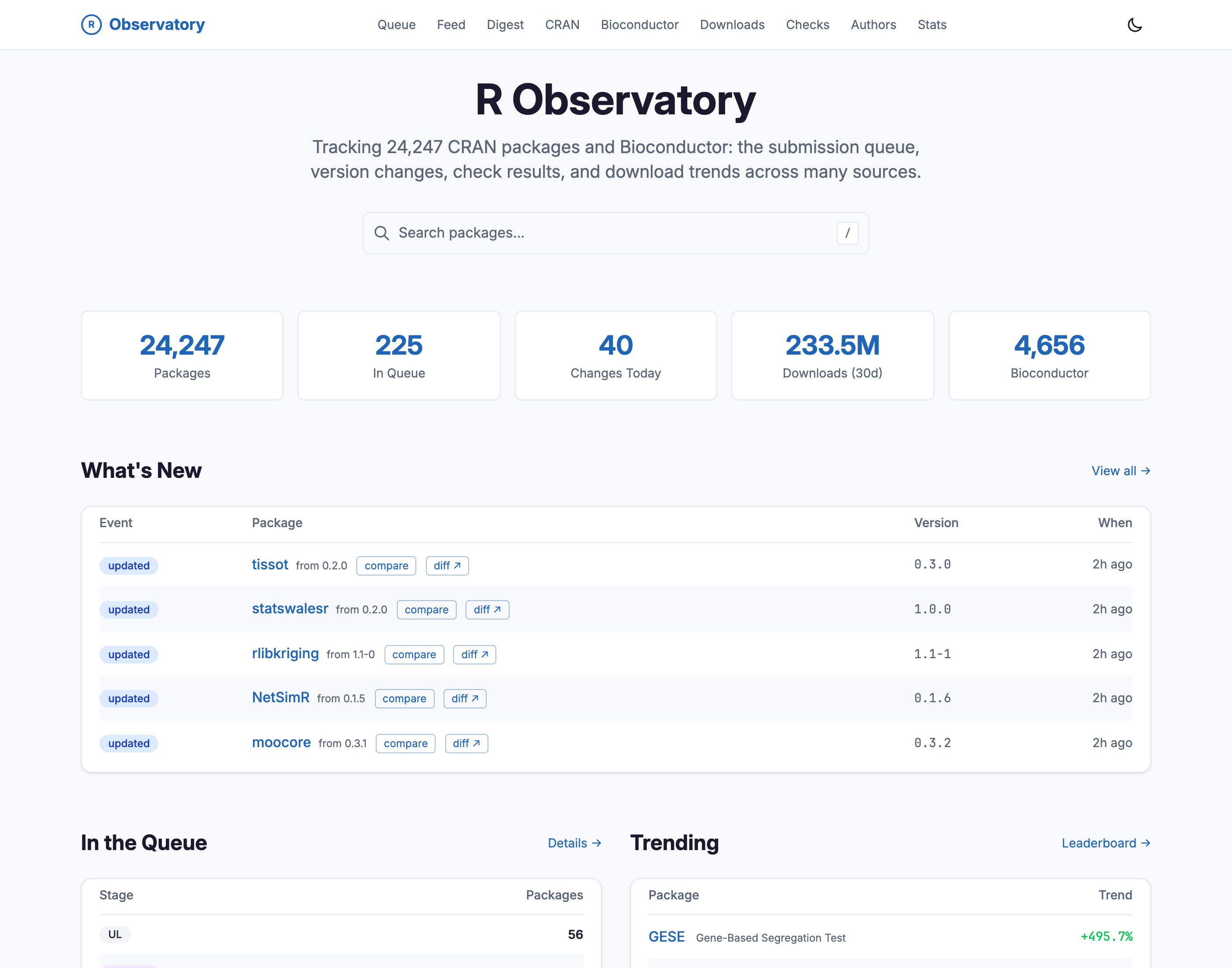
The R Observatory home page in light mode. A large 'R Observatory' title sits over the line 'Tracking 24,247 CRAN packages and Bioconductor: the submission queue, version changes, check results, and download trends across many sources.' Below is a package search box, then a row of five stat cards reading 24,247 Packages, 225 In Queue, 40 Changes Today, 233.5M Downloads over 30 days, and 4,656 Bioconductor. A 'What's New' table lists recently updated packages, each with its version bump, compare and diff links, and a '2h ago' timestamp.

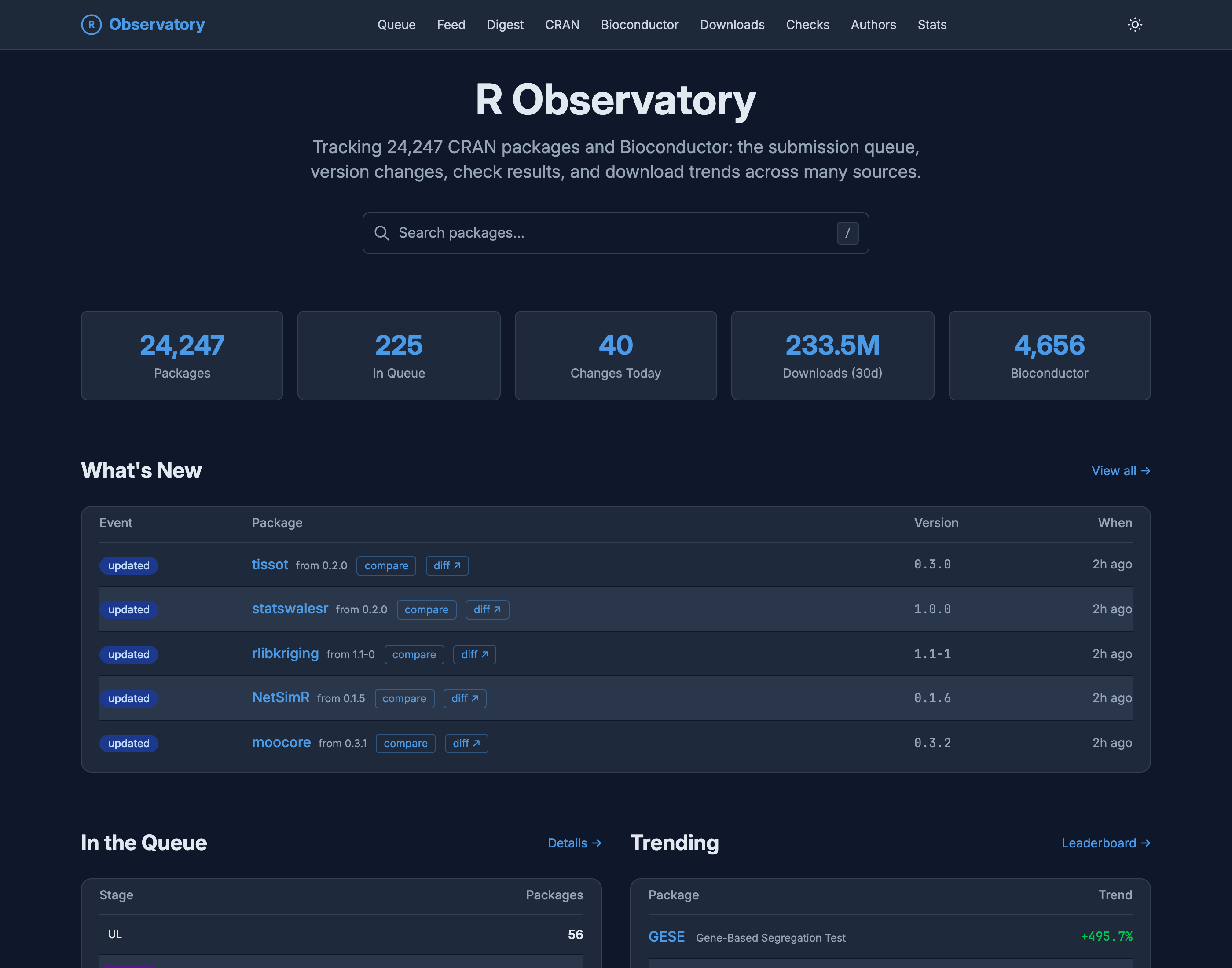
The R Observatory home page in dark mode. A large 'R Observatory' title sits over the line 'Tracking 24,247 CRAN packages and Bioconductor: the submission queue, version changes, check results, and download trends across many sources.' Below is a package search box, then a row of five stat cards reading 24,247 Packages, 225 In Queue, 40 Changes Today, 233.5M Downloads over 30 days, and 4,656 Bioconductor. A 'What's New' table lists recently updated packages, each with its version bump, compare and diff links, and a '2h ago' timestamp.

Figure 1: The front door: the ecosystem at a glance, a search box, and the most recent package changes.

The unit you spend most of your time on is the package. For each package, and for each version of it, the Observatory measures the things you would measure by hand if you had the time: how many lines of code there are and in which languages, how many functions and how many are exported, the shape of the dependency set, test coverage, check results, and the call graph that ties the functions together. Here is what that looks like for ggplot2.
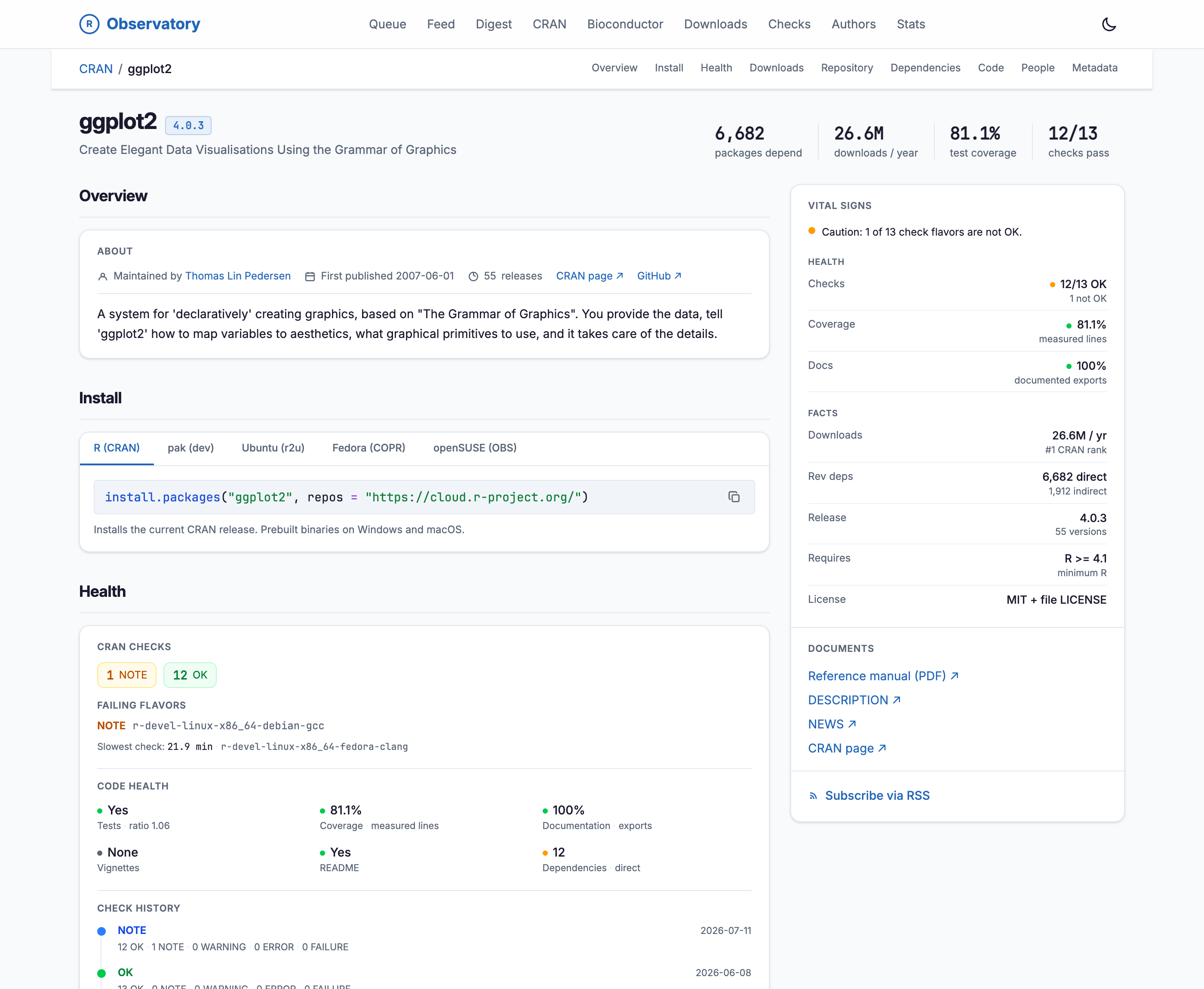
The ggplot2 package page in light mode. A header shows the name, version 4.0.3, and the tagline 'Create Elegant Data Visualisations Using the Grammar of Graphics', beside a topline of fast facts: 6,682 packages depend, 26.6M downloads per year, 81.1% test coverage, and 12 of 13 checks passing. A section navigation lists Overview, Install, Health, Downloads, Repository, Dependencies, Code, People, and Metadata. The Install section shows tabs for R (CRAN), pak (dev), Ubuntu (r2u), Fedora (COPR), and openSUSE (OBS). A right-hand 'Vital Signs' rail summarizes health and facts.

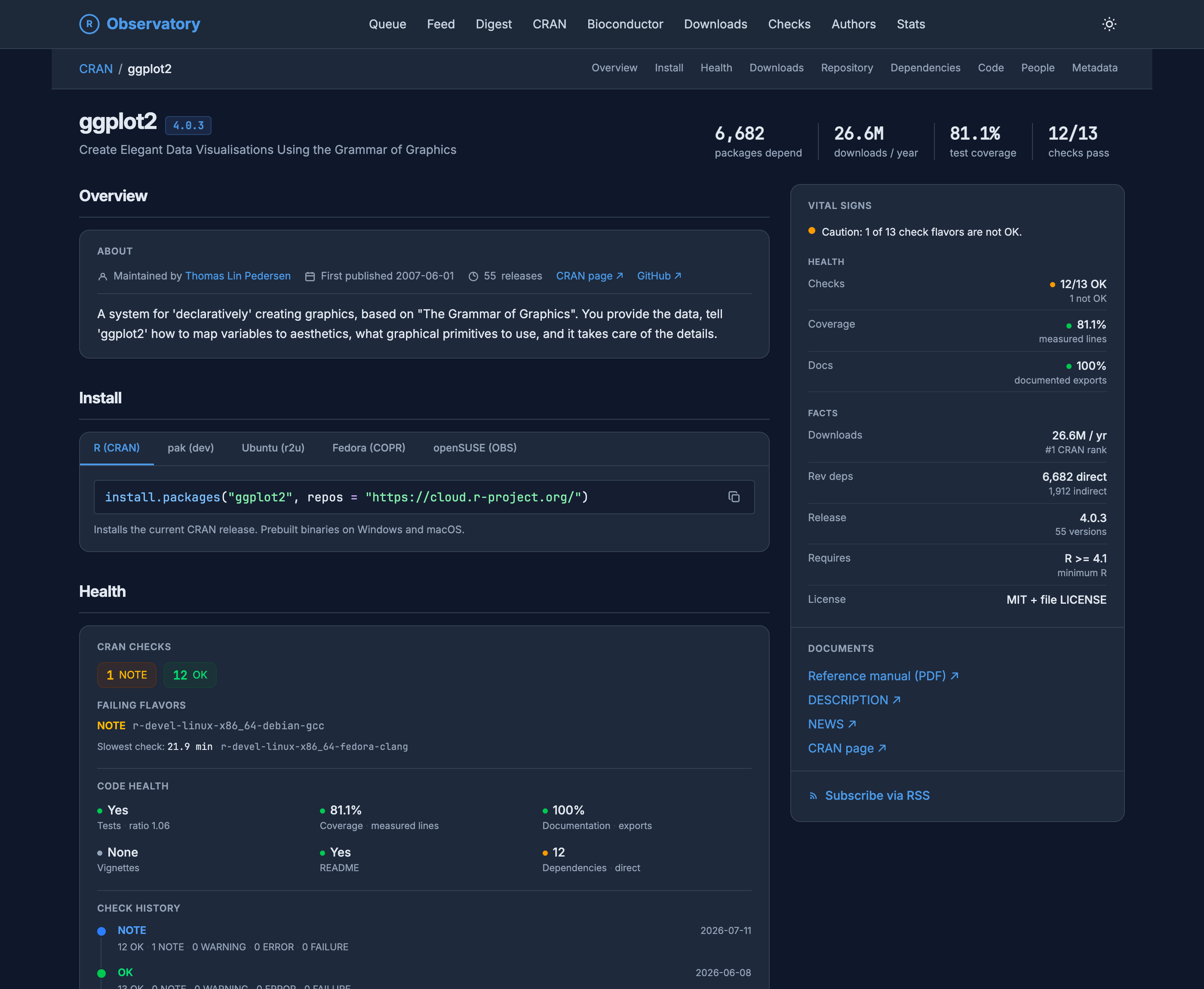
The ggplot2 package page in dark mode. A header shows the name, version 4.0.3, and the tagline 'Create Elegant Data Visualisations Using the Grammar of Graphics', beside a topline of fast facts: 6,682 packages depend, 26.6M downloads per year, 81.1% test coverage, and 12 of 13 checks passing. A section navigation lists Overview, Install, Health, Downloads, Repository, Dependencies, Code, People, and Metadata. The Install section shows tabs for R (CRAN), pak (dev), Ubuntu (r2u), Fedora (COPR), and openSUSE (OBS). A right-hand 'Vital Signs' rail summarizes health and facts.

Figure 2: A single package page for ggplot2: fast facts up top, install instructions for five different channels, and a vital-signs rail that folds health and facts into one column.

None of this is only a snapshot. Each package carries a timeline of every release it has made, with the R versions that bracket them for context and a way into the diff from any point on it.
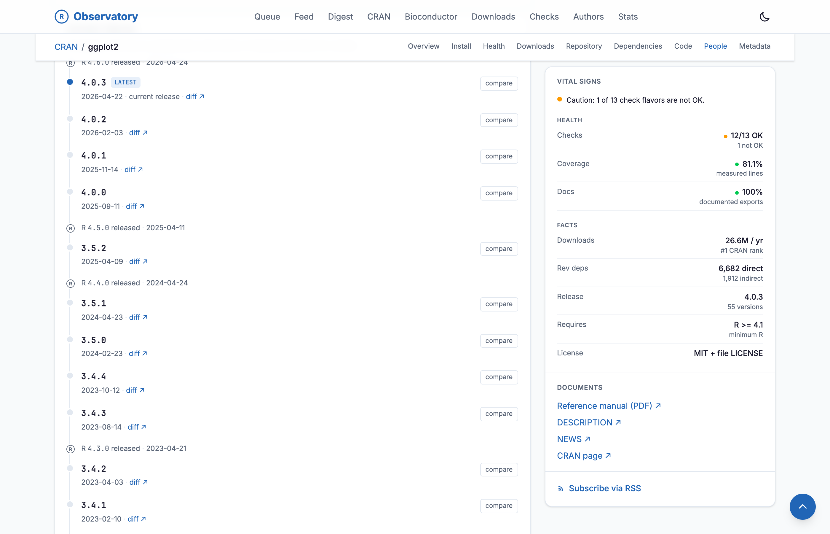
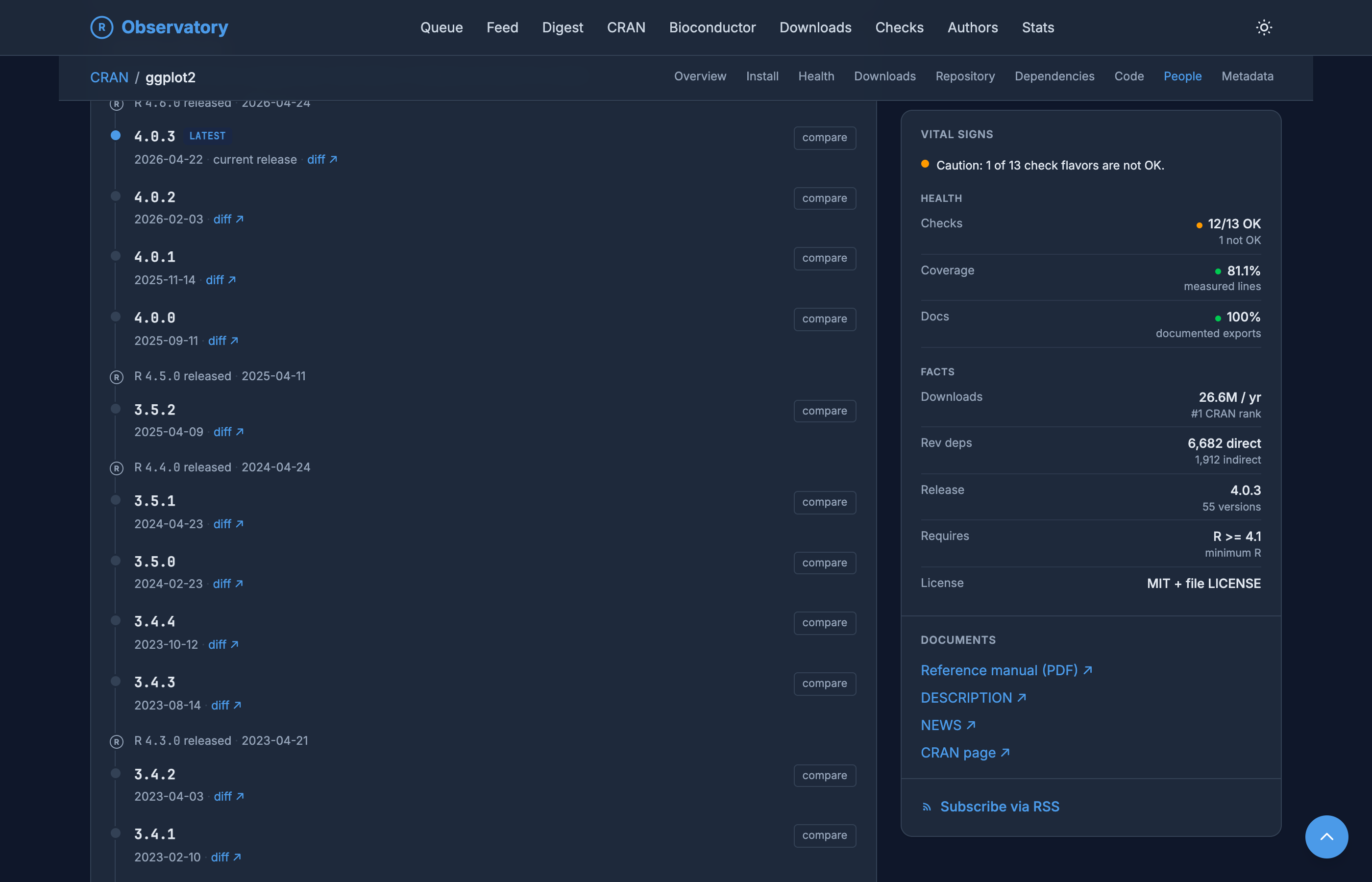
The ggplot2 package timeline, a vertical list of every release from 4.0.3 (latest, dated 2026-04-22) back through 4.0.0, 3.5.2, and earlier to 3.4.1 in 2023, each row showing the version, its release date, a diff link, and a compare button. Major R releases are interleaved as reference points, including R 4.6.0, R 4.5.0, R 4.4.0, and R 4.3.0 with their dates.

The ggplot2 package timeline, a vertical list of every release from 4.0.3 (latest, dated 2026-04-22) back through 4.0.0, 3.5.2, and earlier to 3.4.1 in 2023, each row showing the version, its release date, a diff link, and a compare button. Major R releases are interleaved as reference points, including R 4.6.0, R 4.5.0, R 4.4.0, and R 4.3.0 with their dates.

Figure 3: ggplot2’s release timeline: every version back to its first, the R releases interleaved as markers, and a compare link on each.

That timeline is where the interesting part begins.

Diffing two versions

The feature that most repays keeping history is the version diff. Pick a package, pick two of its releases, and the Observatory shows you what moved between them: metadata, people, and the shape of the code, side by side. It is a changelog the maintainer never had to write.

The clearest example I know is ggplot2 from 3.0.0 to 4.0.0.
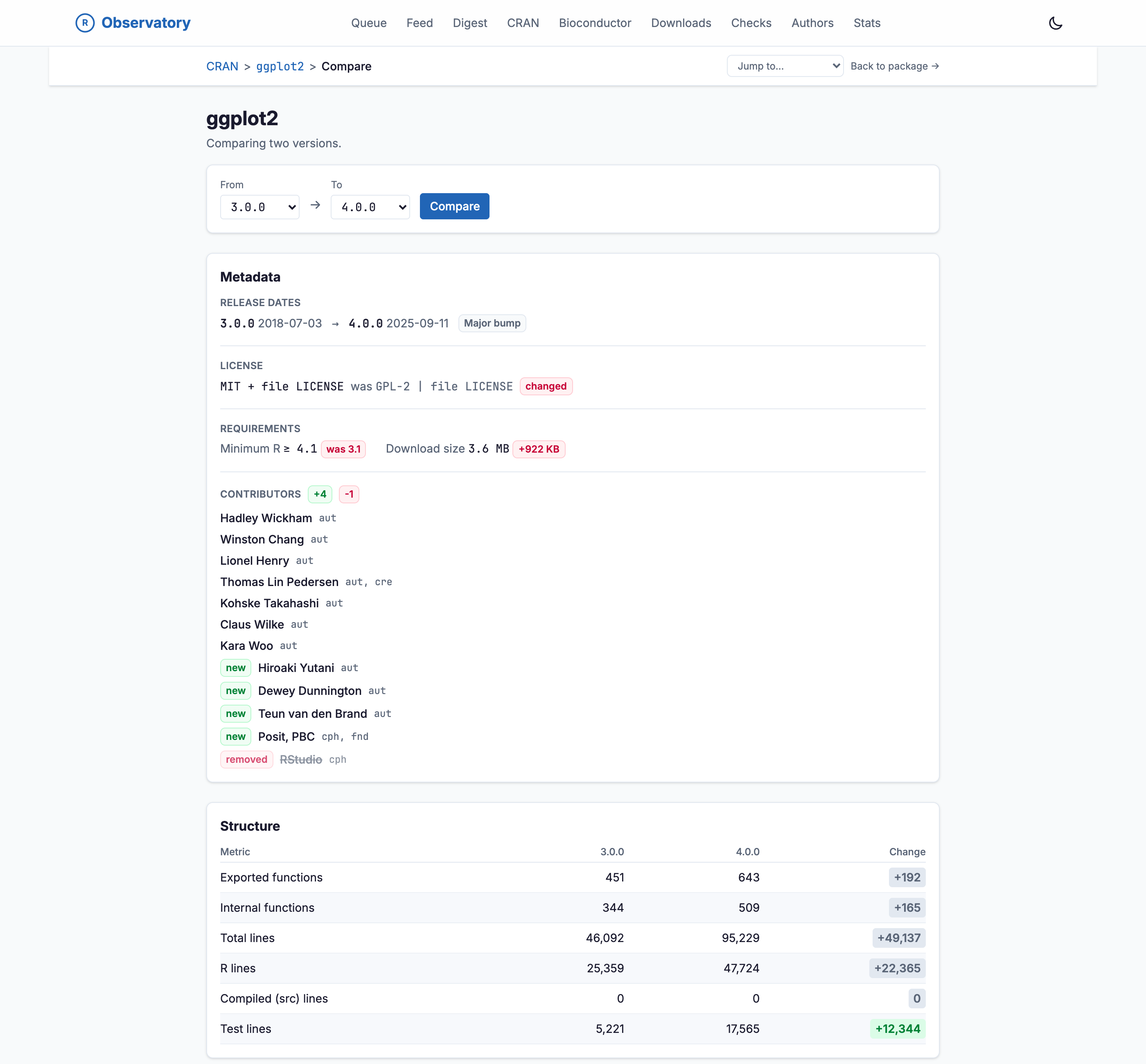
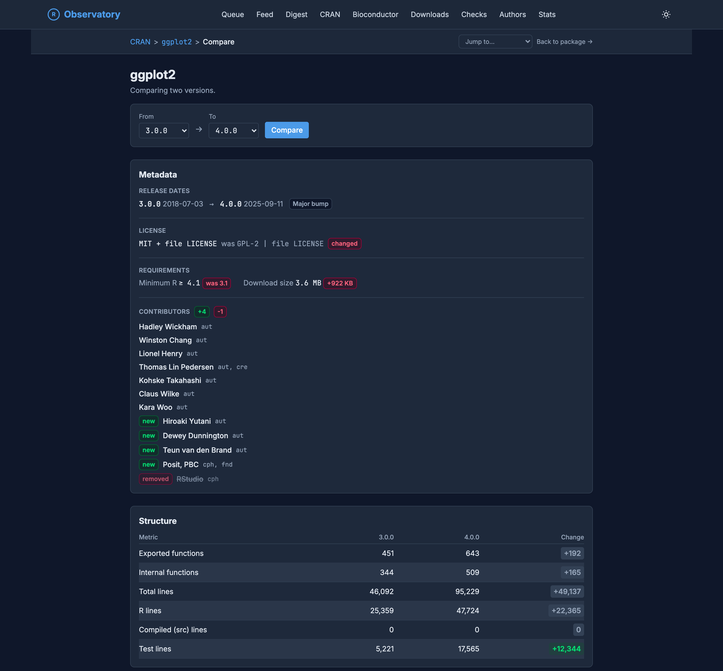
The ggplot2 compare view diffing version 3.0.0 against 4.0.0. A metadata panel shows release dates marked 'Major bump', a license line reading 'MIT + file LICENSE was GPL-2, changed', a minimum-R requirement now 4.1 (was 3.1), a download size up 922 KB, and a contributors list with four names added (badged 'new'), including Posit, PBC as copyright holder, and RStudio removed. Below, a structure table compares the two versions: exported functions 451 to 643 (+192), internal functions 344 to 509 (+165), total lines 46,092 to 95,229 (+49,137), and test lines 5,221 to 17,565 (+12,344).

The ggplot2 compare view diffing version 3.0.0 against 4.0.0. A metadata panel shows release dates marked 'Major bump', a license line reading 'MIT + file LICENSE was GPL-2, changed', a minimum-R requirement now 4.1 (was 3.1), a download size up 922 KB, and a contributors list with four names added (badged 'new'), including Posit, PBC as copyright holder, and RStudio removed. Below, a structure table compares the two versions: exported functions 451 to 643 (+192), internal functions 344 to 509 (+165), total lines 46,092 to 95,229 (+49,137), and test lines 5,221 to 17,565 (+12,344).

Figure 4: The ggplot2 3.0.0 to 4.0.0 diff. The license flips from GPL-2 to MIT, the minimum R version rises, the code roughly doubles, and the author list turns over.

Every line of that is something you would otherwise reconstruct by hand from NEWS files, DESCRIPTION history, and git archaeology. The license row alone is the kind of thing that matters and is easy to miss: ggplot2 relicensed from GPL-2 to MIT, which is a real change in what you are allowed to do downstream, and the diff surfaces it in one line. Around it sit the parts that never make the changelog: the package roughly doubled in size, added 192 exported functions, tripled its test lines, and its copyright holder changed from RStudio to Posit.

The diff goes all the way down to the namespace. A separate panel lists every exported symbol that appeared or vanished between the releases, so an API that quietly grew, or quietly dropped a function someone depended on, is spelled out rather than left to be inferred from a count.
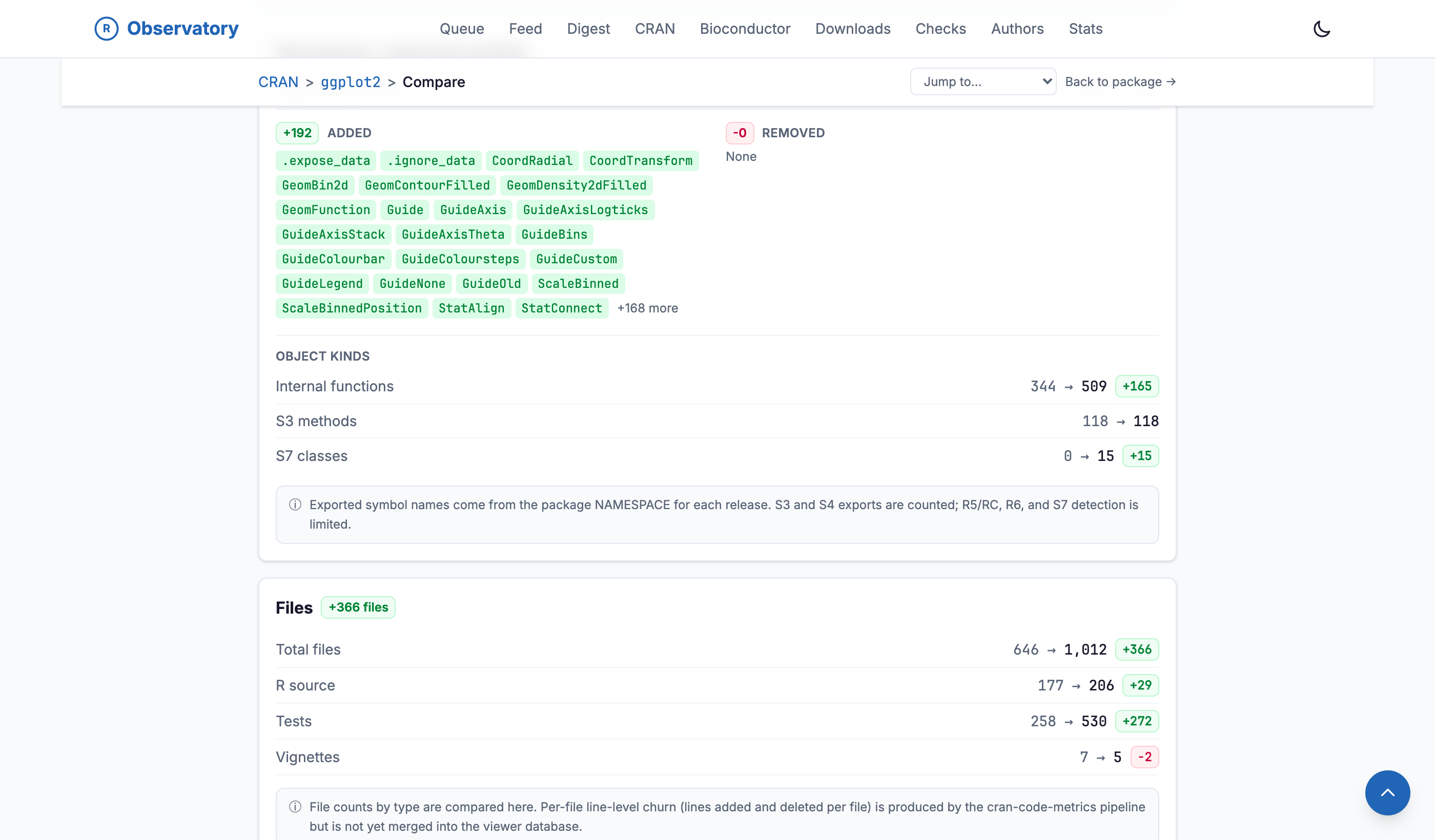
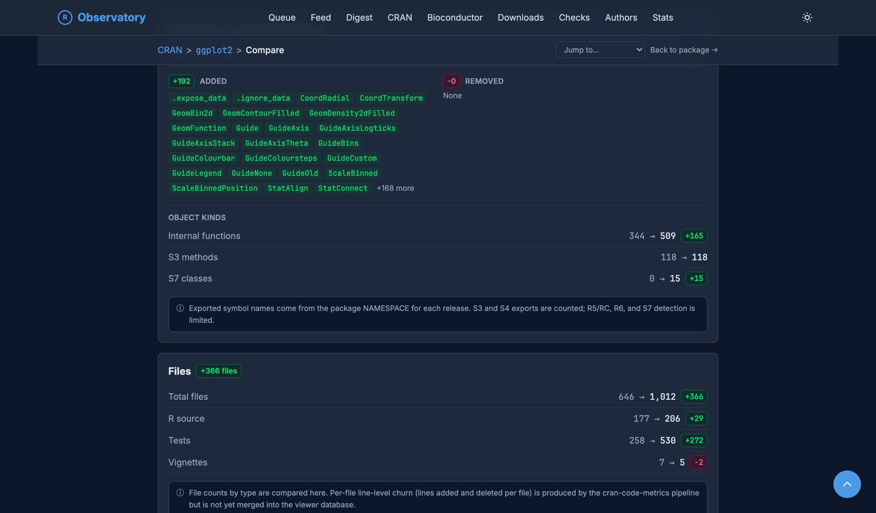
The namespace section of the ggplot2 compare view. An Added column lists 192 newly exported symbols including .expose_data, CoordRadial, GeomBin2d, GuideAxis, ScaleBinned, and StatAlign, with a plus-168-more indicator, while the Removed column reads None. An object-kinds breakdown shows internal functions 344 to 509, S3 methods unchanged at 118, and S7 classes 0 to 15. A note explains that exported symbol names come from the package NAMESPACE for each release.

The namespace section of the ggplot2 compare view. An Added column lists 192 newly exported symbols including .expose_data, CoordRadial, GeomBin2d, GuideAxis, ScaleBinned, and StatAlign, with a plus-168-more indicator, while the Removed column reads None. An object-kinds breakdown shows internal functions 344 to 509, S3 methods unchanged at 118, and S7 classes 0 to 15. A note explains that exported symbol names come from the package NAMESPACE for each release.

Figure 5: The namespace diff for ggplot2 3.0.0 to 4.0.0: 192 exported symbols added, none removed, read from each release’s NAMESPACE.

Downloads across the ecosystem

The downloads view is where the one-channel complaint gets its answer. Python has already been down this road, and the comparison is instructive.

In the Python world, “how many downloads” is a solved-ish problem with a known shape. PyPIStats, and its command-line client, give you the last 180 days of PyPI downloads, and when you need more you drop a level to the PyPI dataset on Google BigQuery, usually through the pypinfo CLI, which has the full history but asks you to bring a cloud account. Friendlier views sit on top of that data, from ClickHouse’s ClickPy to pepy.tech, some of them behind a paid account. But notice what it is all measuring: one index, PyPI, seen at two depths.

R has the first layer and not much of the rest. The cranlogs API is our PyPIStats: it aggregates the raw daily logs the cloud CRAN mirror publishes into a simple service, and nearly every “CRAN downloads” badge and casual citation traces back to it, the way PyPIStats sits over BigQuery. What R does not really have is the “count it everywhere” layer, because R installs are not one index. They are spread across CRAN, Bioconductor, conda, the distribution builds, and more, and no single service adds them up.

That is what the downloads view is for. Instead of a single CRAN number, installs are shown across the distribution landscape a package lives in, source by source.
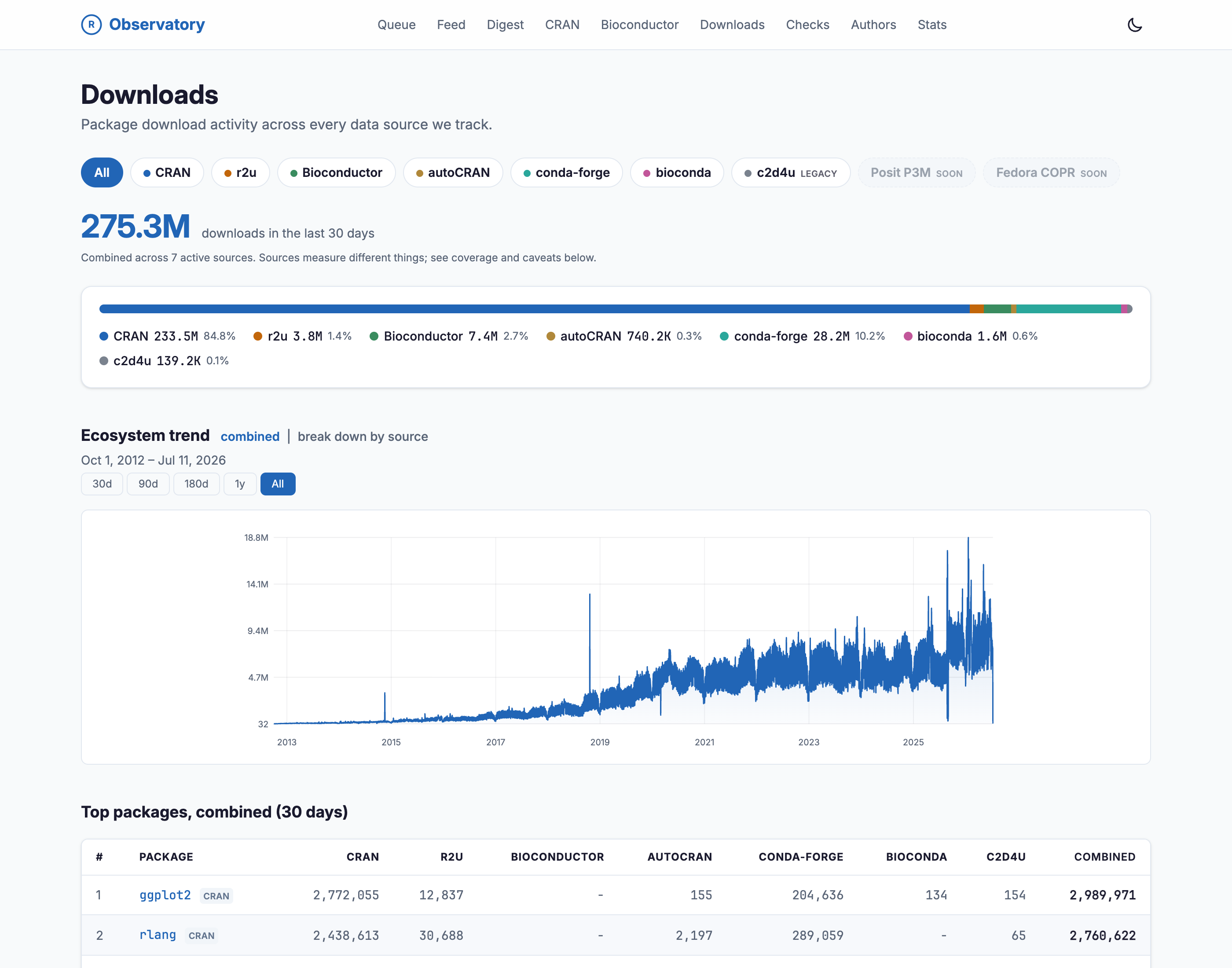
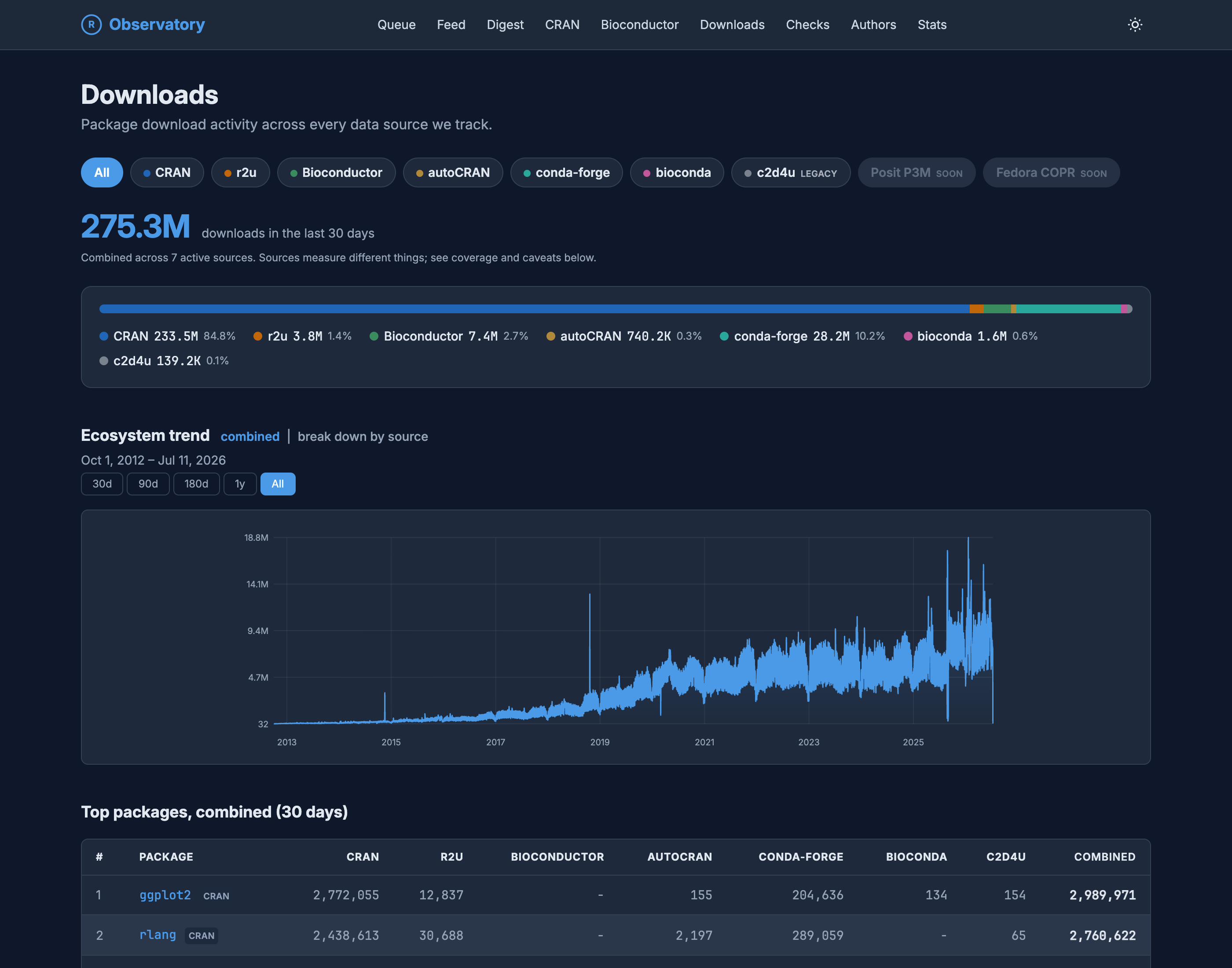
The Observatory Downloads overview in light mode, subtitled 'Package download activity across every data source we track.' Source filter chips read All, CRAN, r2u, Bioconductor, autoCRAN, conda-forge, bioconda, and c2d4u (legacy), with Posit P3M and Fedora COPR marked 'soon'. A headline of 275.3M downloads in the last 30 days sits above the note 'Combined across 7 active sources. Sources measure different things; see coverage and caveats below.' A stacked bar breaks the total down by source: CRAN 84.8%, conda-forge 10.2%, Bioconductor 2.7%, r2u 1.4%, then smaller shares. Below, an 'Ecosystem trend' area chart runs from October 2012 to July 2026.

The Observatory Downloads overview in dark mode, subtitled 'Package download activity across every data source we track.' Source filter chips read All, CRAN, r2u, Bioconductor, autoCRAN, conda-forge, bioconda, and c2d4u (legacy), with Posit P3M and Fedora COPR marked 'soon'. A headline of 275.3M downloads in the last 30 days sits above the note 'Combined across 7 active sources. Sources measure different things; see coverage and caveats below.' A stacked bar breaks the total down by source: CRAN 84.8%, conda-forge 10.2%, Bioconductor 2.7%, r2u 1.4%, then smaller shares. Below, an 'Ecosystem trend' area chart runs from October 2012 to July 2026.

Figure 6: Seven active sources combined, with an explicit caveat that they are not measuring the same event, and a trend line that runs back to 2012.

The value of the combined view is the breakdown, not the grand total. The sources measure different things. A CRAN mirror hit, a conda package pull, and an r2u binary install are different events, and the page keeps them separate rather than folding them into one quantity. Read the combined number as “activity across channels,” not “unique humans.” Even with that caveat, some packages look completely different once you widen the lens. A package with a modest CRAN count can carry a large share of its installs through r2u or conda, and there is no way to see that from the CRAN counter alone.

To make that kind of gap concrete, the downloads compare view puts several packages on one chart. Line up Rcpp, V8, and reticulate on the same axis, split by source, with each package’s releases and the major R versions drawn in as reference lines, and the differences in scale and rhythm are hard to miss.
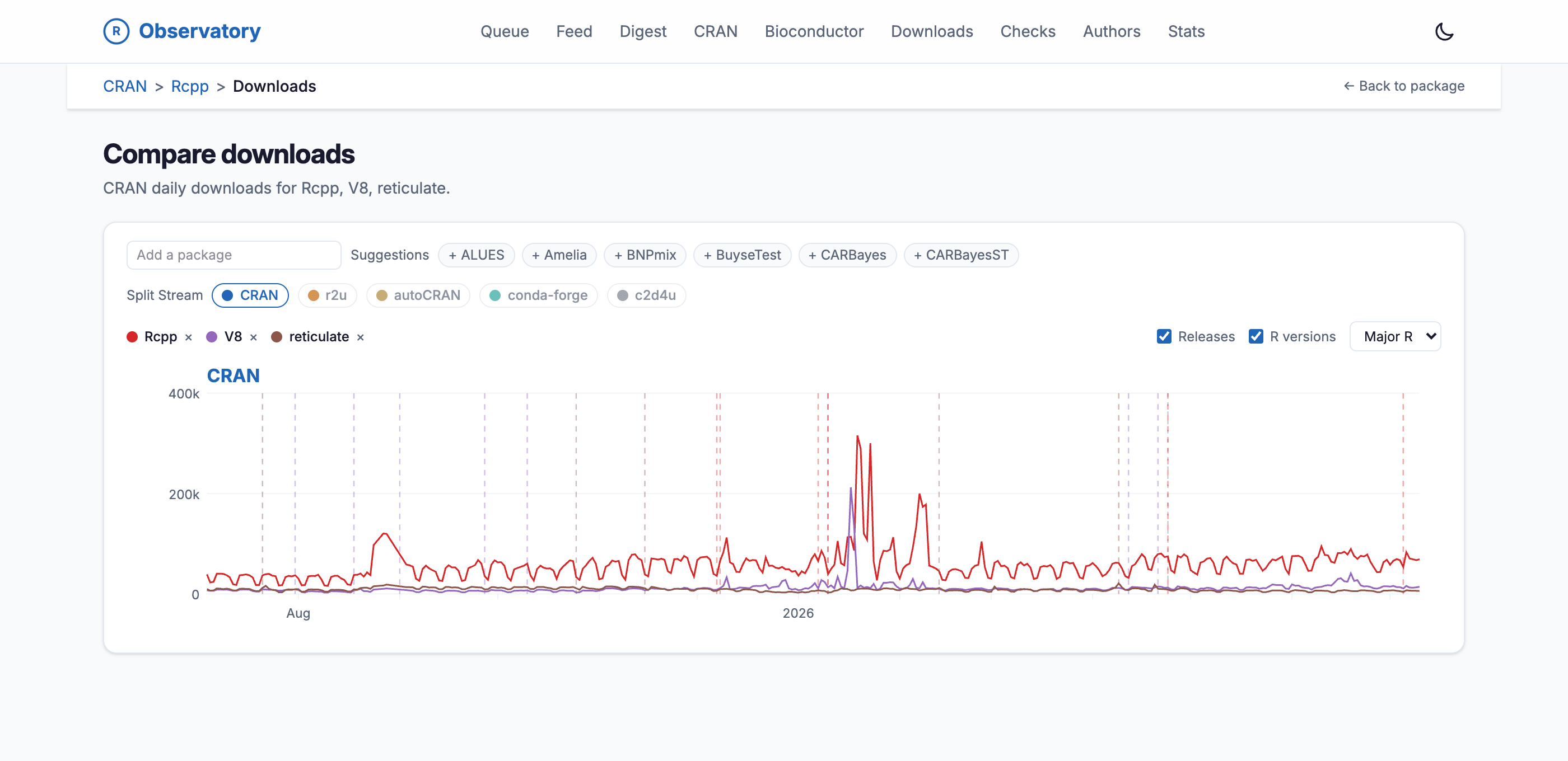
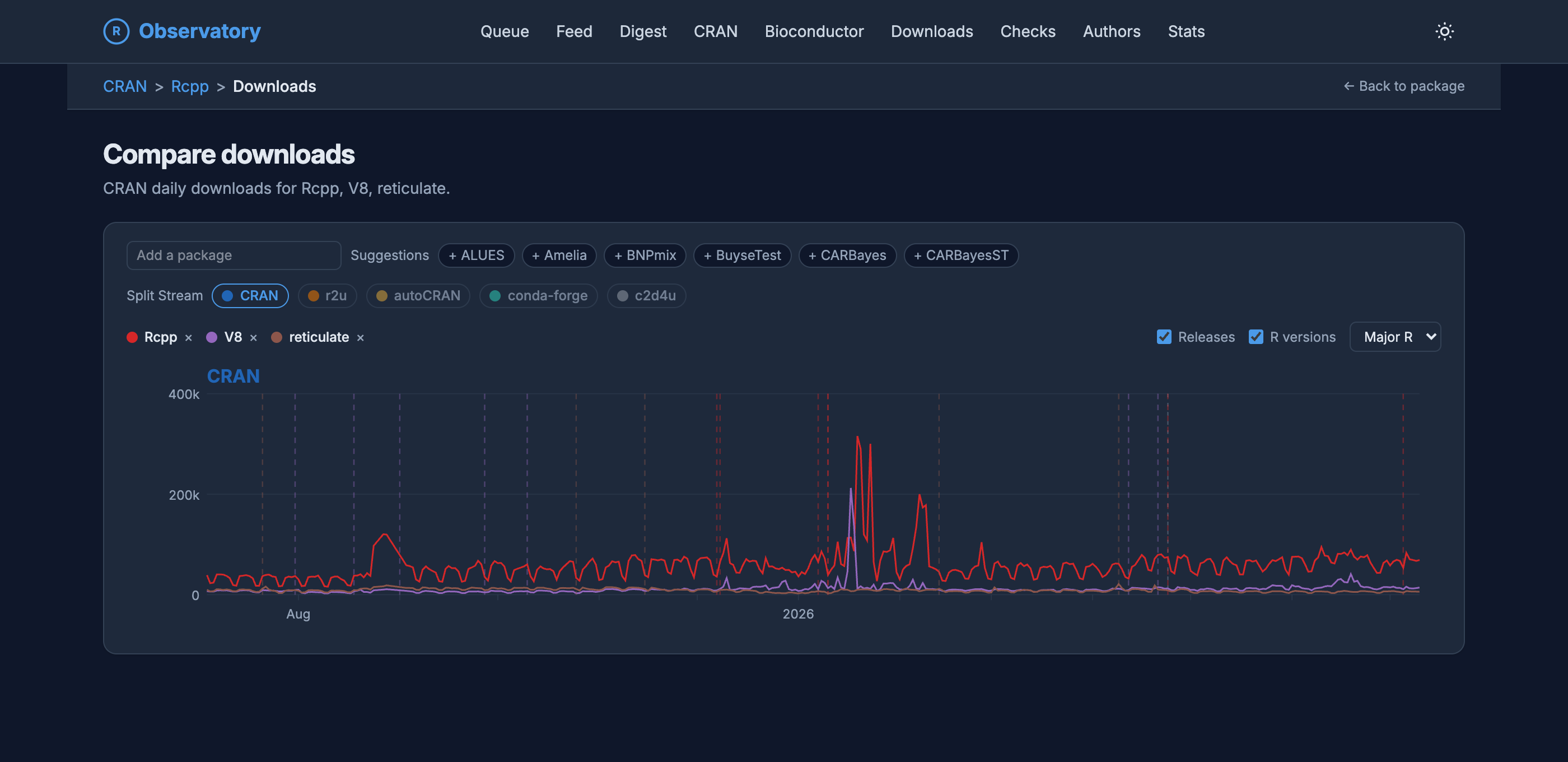
The Compare downloads view on the R Observatory, subtitled 'CRAN daily downloads for Rcpp, V8, reticulate.' An 'Add a package' box sits beside package suggestions, a Split Stream row with CRAN selected among r2u, autoCRAN, conda-forge, and c2d4u, and removable legend chips for Rcpp, V8, and reticulate. A line chart plots the three packages' CRAN daily downloads over roughly a year: Rcpp in red runs highest with spikes near 300 thousand, V8 in purple has a single tall spike near 200 thousand, and reticulate in brown stays low. Dashed vertical lines mark package releases and major R versions.

The Compare downloads view on the R Observatory, subtitled 'CRAN daily downloads for Rcpp, V8, reticulate.' An 'Add a package' box sits beside package suggestions, a Split Stream row with CRAN selected among r2u, autoCRAN, conda-forge, and c2d4u, and removable legend chips for Rcpp, V8, and reticulate. A line chart plots the three packages' CRAN daily downloads over roughly a year: Rcpp in red runs highest with spikes near 300 thousand, V8 in purple has a single tall spike near 200 thousand, and reticulate in brown stays low. Dashed vertical lines mark package releases and major R versions.

Figure 7: Rcpp, V8, and reticulate on one download axis, split by source, with release and R-version markers drawn in.

Code, colored by coverage

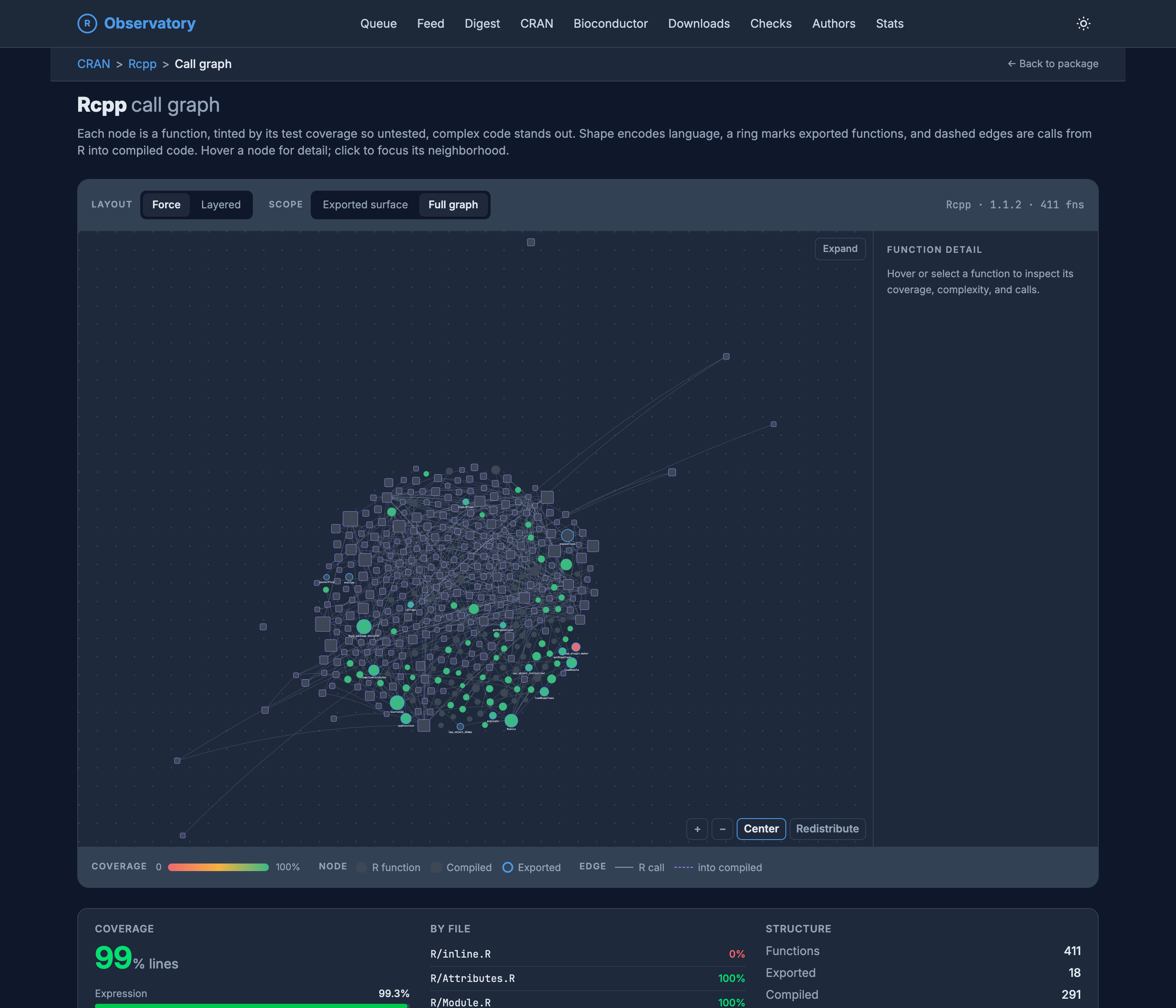
The Observatory does not stop at the package boundary. It goes into the code itself. For any package with tests, it builds a call graph where every function is a node, and tints each node by its test coverage on a red-to-green scale. Untested, complicated code does not hide in a table; it lights up red.
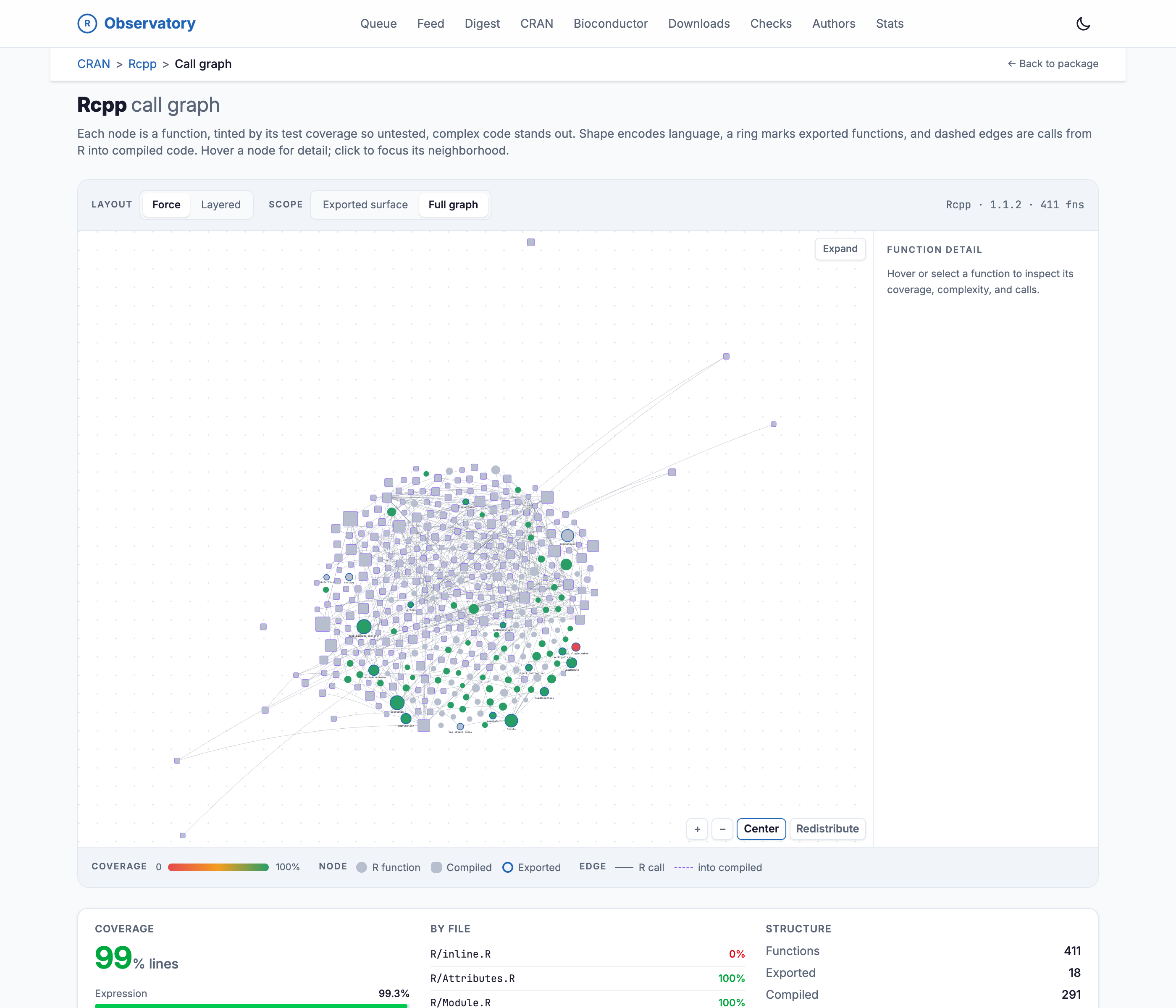
The Rcpp call graph in light mode, a force-directed network where each node is a function tinted by test coverage on a red-to-green scale, squares for compiled code and circles for R, rings marking exported functions, dashed edges for calls from R into compiled code. Most nodes are green or gray; one sits red for untested. Below, a coverage panel reads 99% of lines, a by-file list shows R/inline.R at 0% in red with the rest at 100%, and a structure count of 411 functions, 18 exported, 291 compiled, 497 call edges.

The Rcpp call graph in dark mode, a force-directed network where each node is a function tinted by test coverage on a red-to-green scale, squares for compiled code and circles for R, rings marking exported functions, dashed edges for calls from R into compiled code. Most nodes are green or gray; one sits red for untested. Below, a coverage panel reads 99% of lines, a by-file list shows R/inline.R at 0% in red with the rest at 100%, and a structure count of 411 functions, 18 exported, 291 compiled, 497 call edges.

Figure 8: The Rcpp call graph. Shape encodes language, a ring marks exported functions, dashed edges are calls from R into compiled code, and color is coverage. Rcpp sits at 99 percent, so the one red file, R/inline.R at zero, is easy to spot.

The point is not to shame anyone; a red node is often a deliberate choice, like a plotting helper or an interactive function that is hard to test. The point is that “81 percent coverage” and “this specific, central, complicated function has no tests” are very different facts, and only one of them fits in a badge.

The graph is a way in, not only a picture. Select any node and a panel opens with that function’s line count, cyclomatic complexity, coverage, and the functions it calls, so “something in here is untested” turns into a named function and its neighborhood in one click.
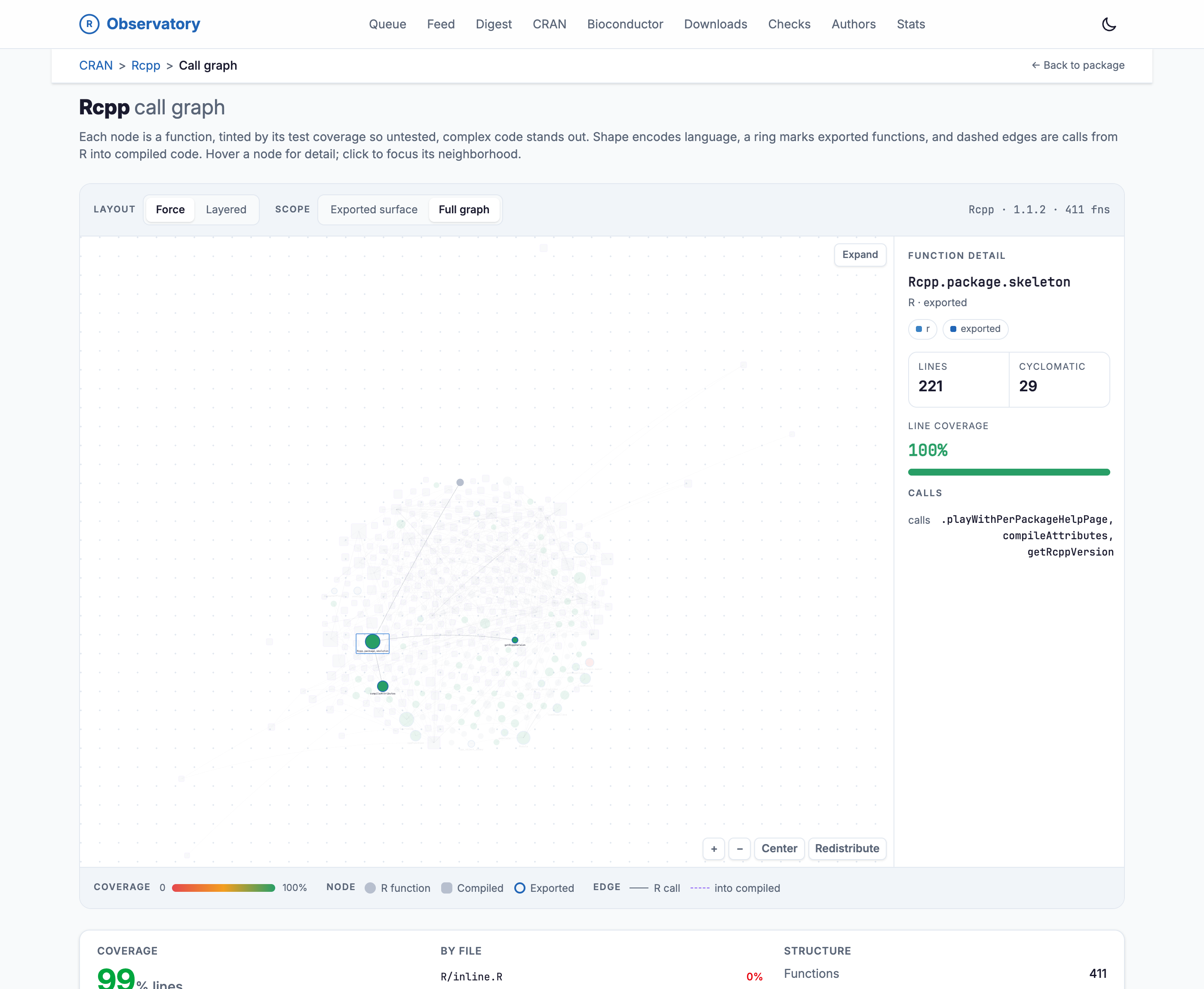
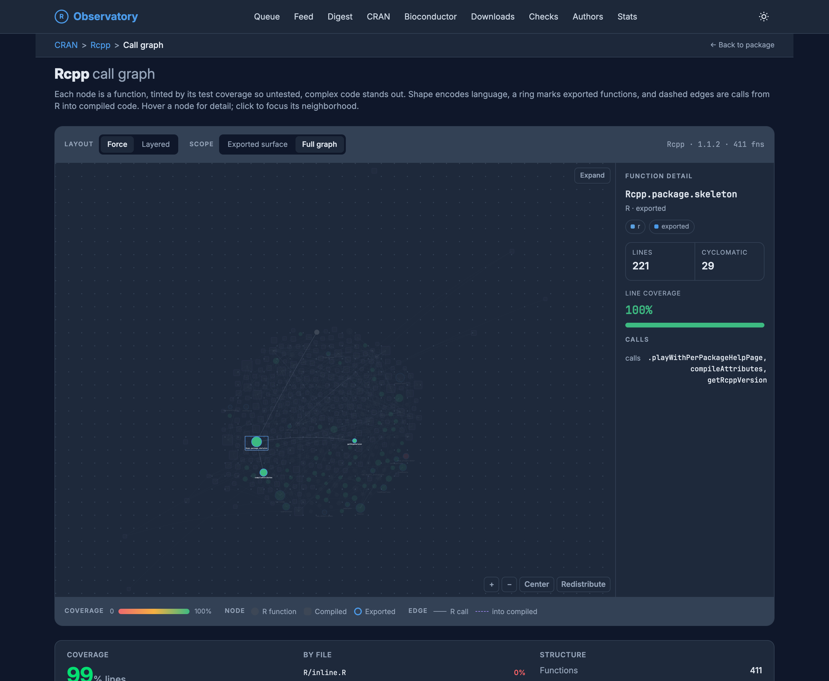
The Rcpp call graph with one node selected. The node Rcpp.package.skeleton is highlighted and its neighborhood focused while the rest of the graph dims. A Function Detail panel on the right shows it is an exported R function with 221 lines, cyclomatic complexity 29, 100 percent line coverage, and calls to .playWithPerPackageHelpPage, compileAttributes, and getRcppVersion.

The Rcpp call graph with one node selected. The node Rcpp.package.skeleton is highlighted and its neighborhood focused while the rest of the graph dims. A Function Detail panel on the right shows it is an exported R function with 221 lines, cyclomatic complexity 29, 100 percent line coverage, and calls to .playWithPerPackageHelpPage, compileAttributes, and getRcppVersion.

Figure 9: Selecting Rcpp.package.skeleton pulls up its detail: 221 lines, cyclomatic complexity 29, full coverage, and the three functions it calls.

Dependencies, and what they oblige

Depending on a package means depending on its license, and its dependencies’ licenses, all the way down. The dependency-licenses view walks the whole install tree and gives you a plain verdict: whether anything copyleft is hiding under a permissively licensed package you thought was safe to vendor.
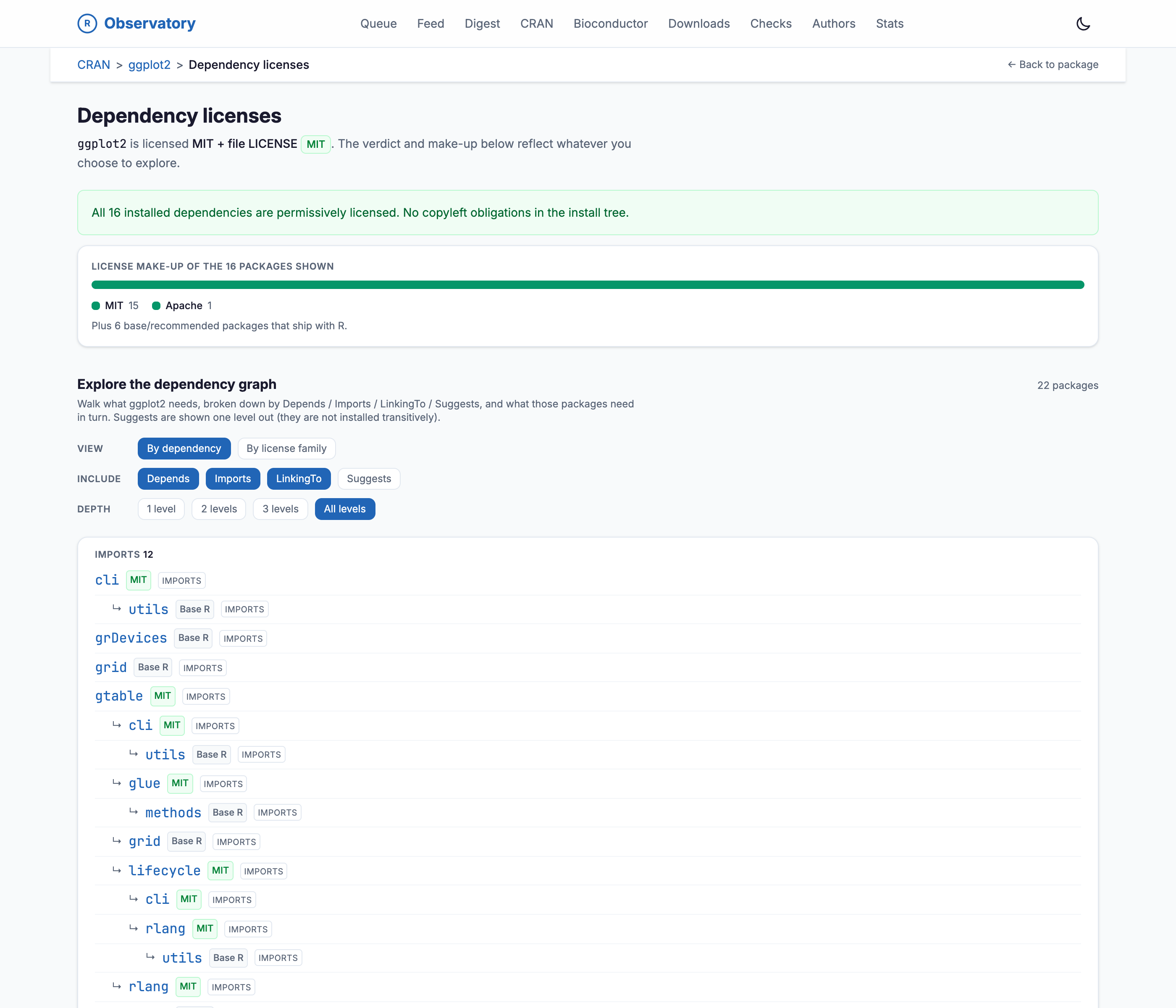
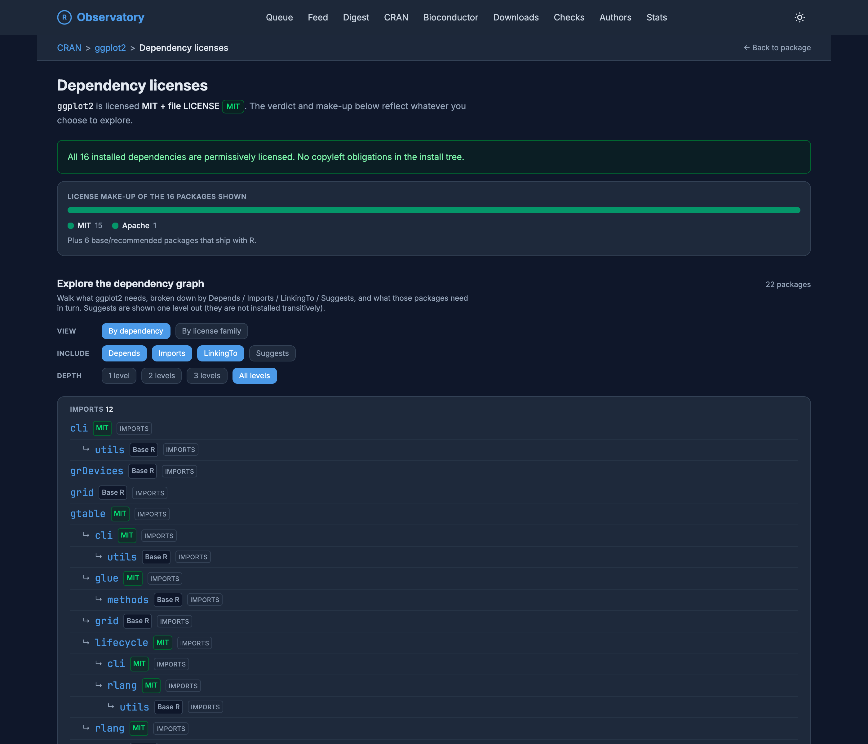
The ggplot2 dependency-licenses page in light mode. A green verdict banner reads 'All 16 installed dependencies are permissively licensed. No copyleft obligations in the install tree.' A make-up bar shows MIT 15 and Apache 1, plus 6 base or recommended packages that come with R. Below, an explorer walks the dependency graph by Depends, Imports, LinkingTo, and Suggests, each package tagged with its license family in a tree that expands several levels deep.

The ggplot2 dependency-licenses page in dark mode. A green verdict banner reads 'All 16 installed dependencies are permissively licensed. No copyleft obligations in the install tree.' A make-up bar shows MIT 15 and Apache 1, plus 6 base or recommended packages that come with R. Below, an explorer walks the dependency graph by Depends, Imports, LinkingTo, and Suggests, each package tagged with its license family in a tree that expands several levels deep.

Figure 10: ggplot2’s install tree comes back clean: 16 dependencies, all permissive. When it does not, the verdict says which package introduces the obligation and where in the tree it sits.

The same machinery powers the reverse view. Every package page knows its reverse dependencies, direct and transitive, so you can see not just what a package needs but who would feel it if the package broke. For something like ggplot2, that blast radius is most of the tidyverse and a good deal beyond it.

Who wrote it

Packages are written by people, and people show up across many packages. Every author gets a page, and every author gets a co-authorship network: a graph of everyone they have shared a package byline with, with heavier lines for more shared work.
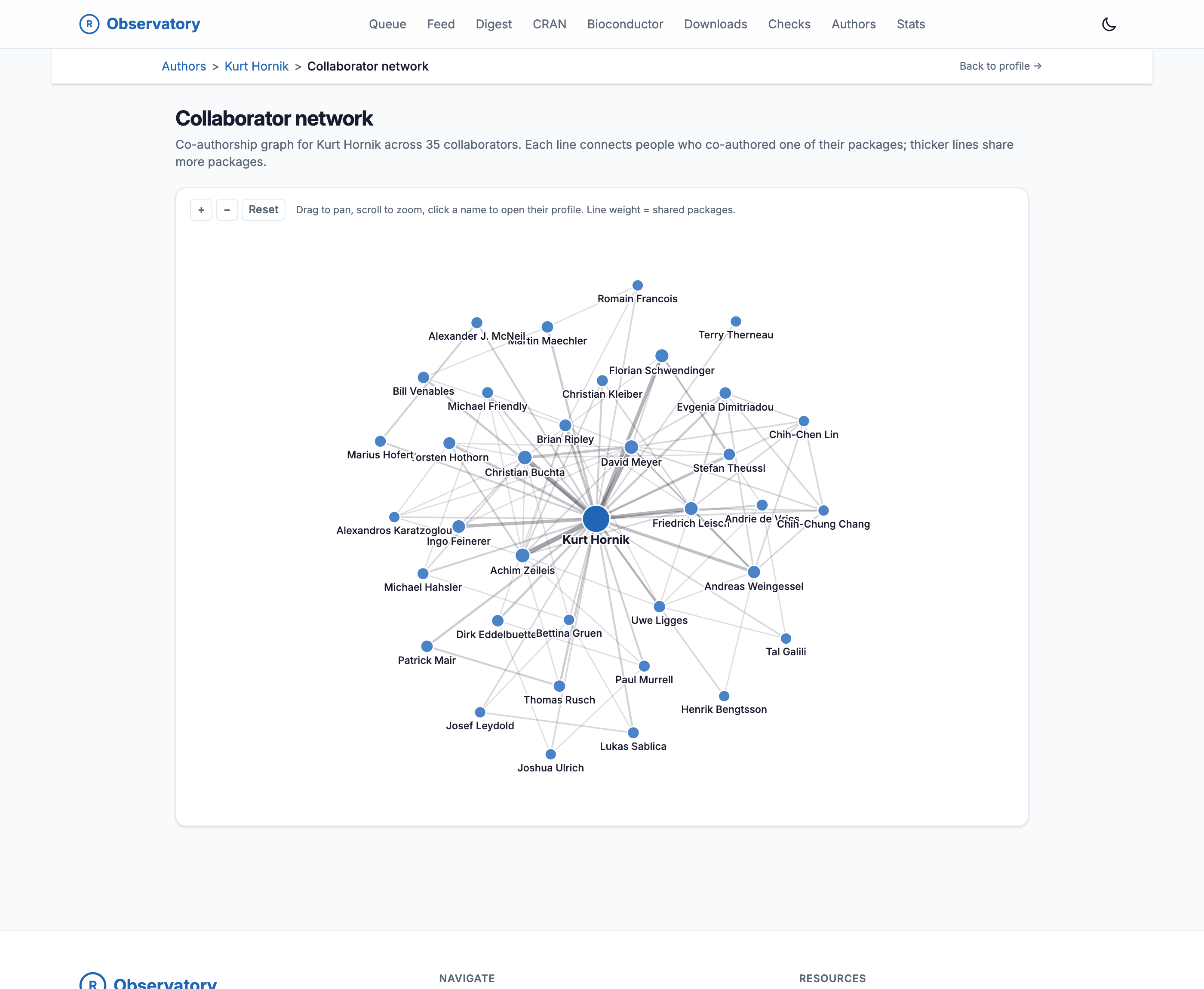
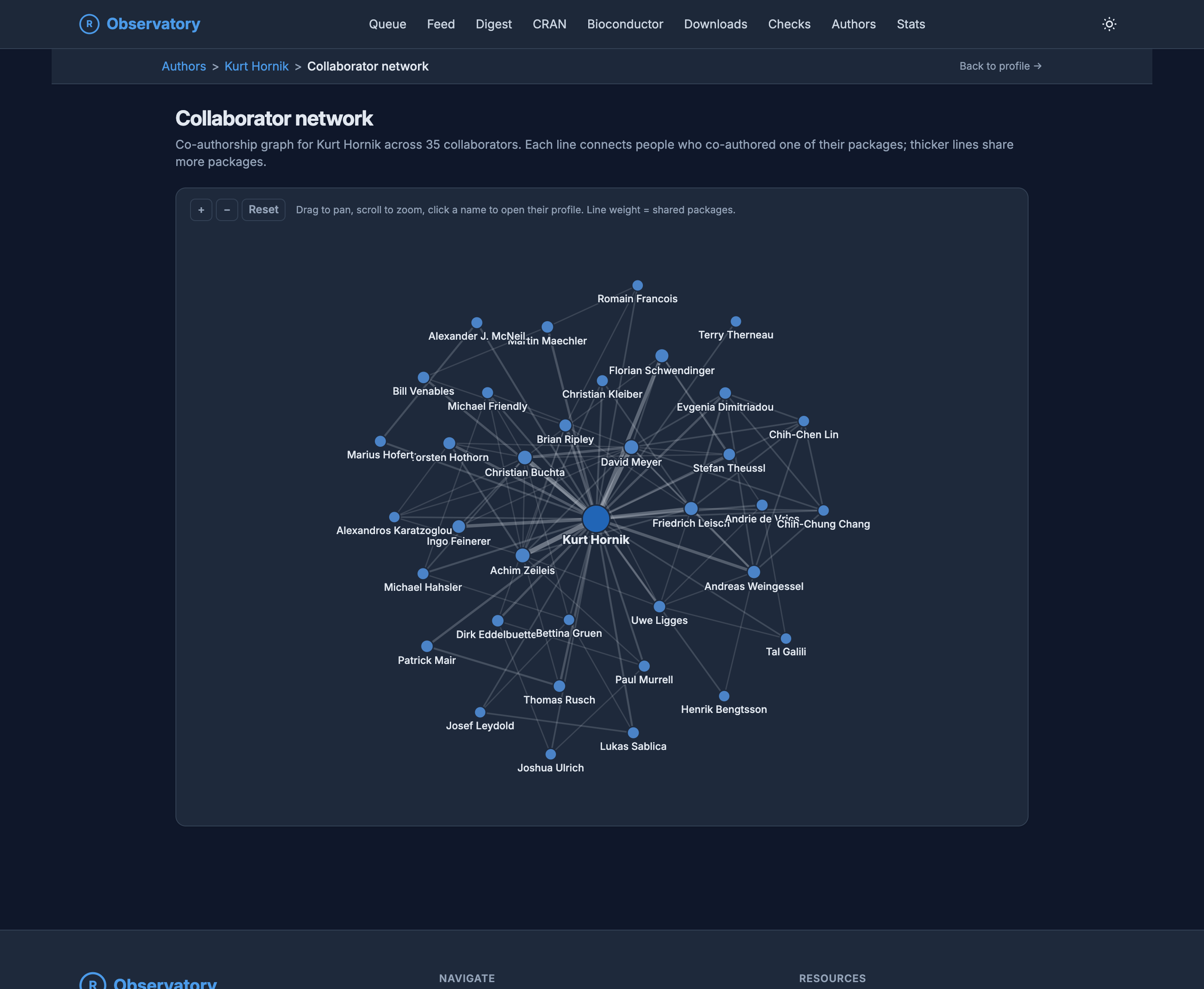
The collaborator network for Kurt Hornik in light mode, a co-authorship graph across 35 collaborators. Kurt Hornik is a large central node, with named collaborators including Achim Zeileis, Friedrich Leisch, Brian Ripley, David Meyer, Bettina Gruen, and Dirk Eddelbuettel arranged around him, connected by lines whose thickness grows with the number of shared packages.

The collaborator network for Kurt Hornik in dark mode, a co-authorship graph across 35 collaborators. Kurt Hornik is a large central node, with named collaborators including Achim Zeileis, Friedrich Leisch, Brian Ripley, David Meyer, Bettina Gruen, and Dirk Eddelbuettel arranged around him, connected by lines whose thickness grows with the number of shared packages.

Figure 11: Kurt Hornik’s co-authorship network. The shape of a maintainer’s collaborations is its own kind of signal about a corner of the ecosystem.

Bioconductor, on its own terms

Everything so far has been CRAN. Half the point of the Observatory is that it does not stop there. Bioconductor is the other big R repository, and it is not just CRAN with different packages. It runs on a twice-a-year release cycle, sorts its packages into software, annotation, experiment, and workflow categories, and files each one under the hierarchical biocViews topic tree. Treating it like a CRAN clone would lose all of that, so the Observatory tracks it in its native vocabulary.
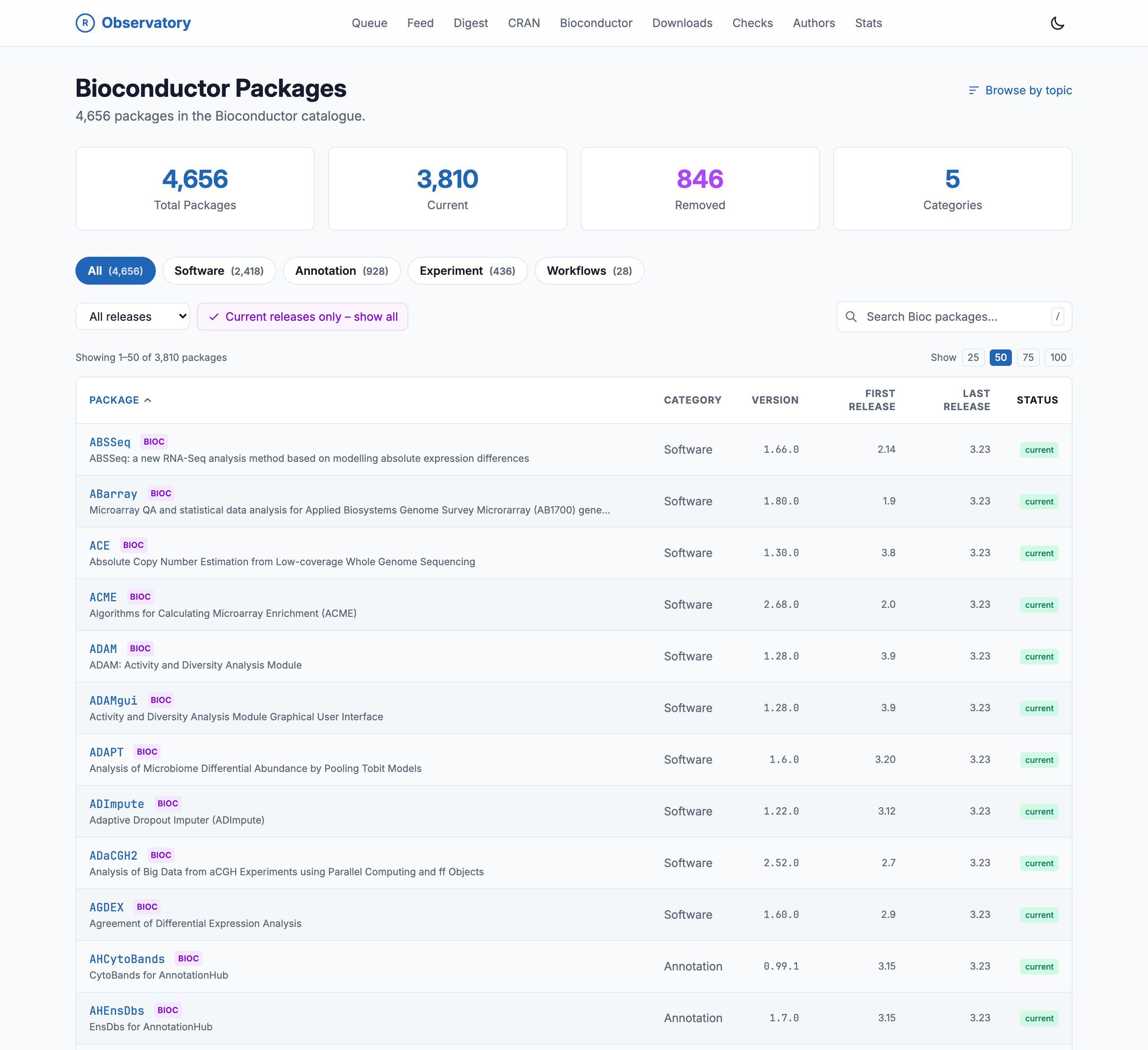
The Bioconductor overview page of the R Observatory, titled Bioconductor Packages with 4,656 in the catalog. Stat cards read 4,656 total packages, 3,810 current, 846 removed, and 5 categories. Category filter chips read All, Software (2,418), Annotation (928), Experiment (436), and Workflows (28). A sortable table lists packages, each tagged BIOC, with columns for category, version, first release, last release given as Bioconductor release numbers, and status.

The Bioconductor overview page of the R Observatory, titled Bioconductor Packages with 4,656 in the catalog. Stat cards read 4,656 total packages, 3,810 current, 846 removed, and 5 categories. Category filter chips read All, Software (2,418), Annotation (928), Experiment (436), and Workflows (28). A sortable table lists packages, each tagged BIOC, with columns for category, version, first release, last release given as Bioconductor release numbers, and status.

Figure 12: The Bioconductor catalog: 4,656 packages sorted into their native categories, each carrying the releases it first and last appeared in.

A package page speaks Bioconductor too. Instead of a plain version history it shows a release lineage: which of Bioconductor’s releases the package has appeared in, from the one it entered to the current one. apeglm, a Bayesian shrinkage estimator that DESeq2 leans on, has turned up in 18 of Bioconductor’s 49 releases since it entered at release 3.6 in 2017. Its biocViews topics place it in the tree, its dependencies are tagged by origin so the Bioconductor ones stand apart from the CRAN ones, and its code is read the same way a CRAN package’s is: a call graph down to the compiled C++ routines it drops into, with function and complexity counts beside it.
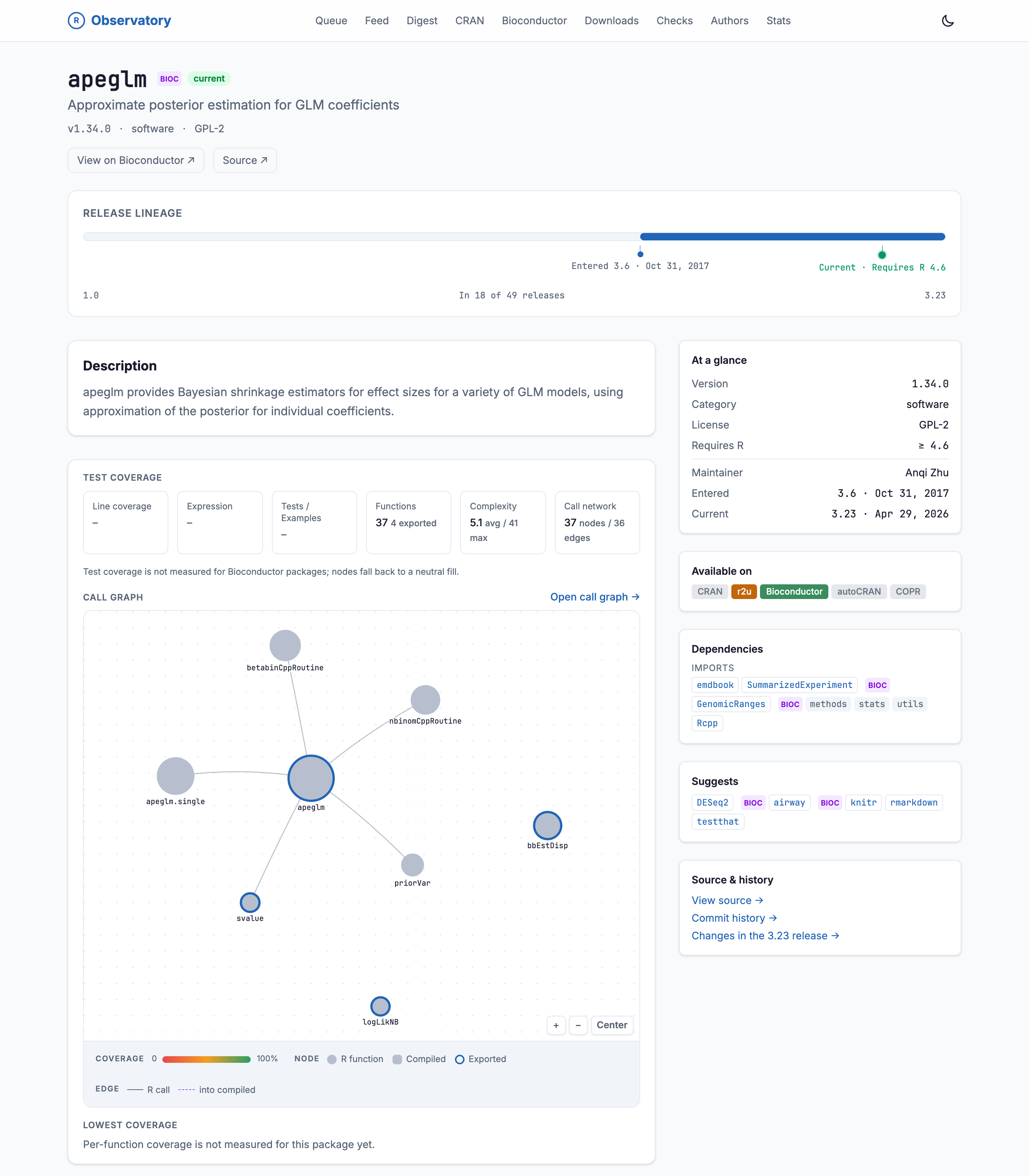
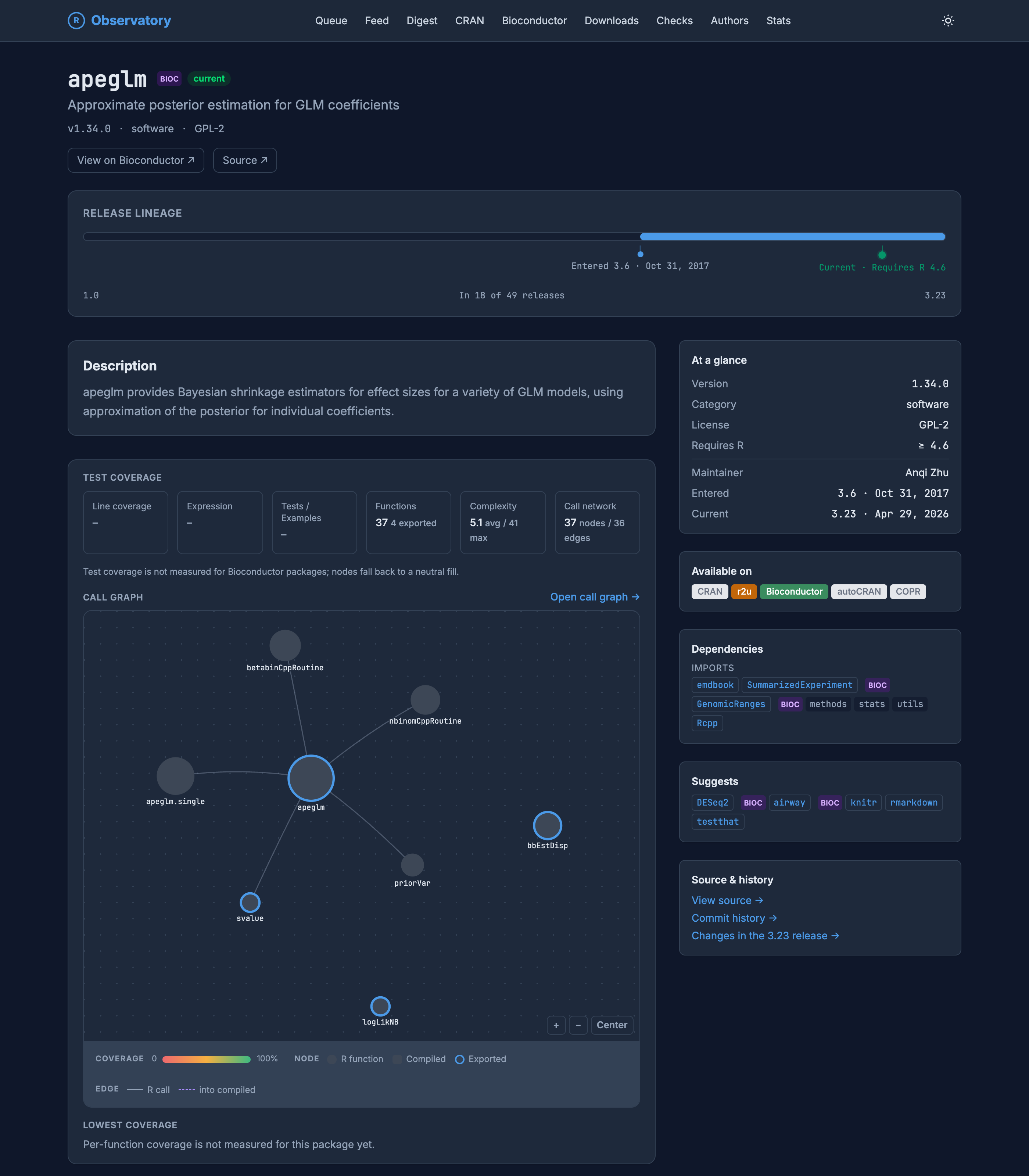
The apeglm package page on the R Observatory, tagged BIOC and current, version 1.34.0, category software, license GPL-2. A Release Lineage bar shows it entered at Bioconductor release 3.6 in October 2017 and appears in 18 of 49 releases, current at 3.23. A Test Coverage panel reports line and expression coverage as not measured, 37 functions with 4 exported, average complexity 5.1 and maximum 41, and a call network of 37 nodes and 36 edges, with a note that test coverage is not measured for Bioconductor packages so nodes fall back to a neutral fill. Below, a call graph renders apeglm and its functions, including the compiled C++ routines betabinCppRoutine and nbinomCppRoutine. An at-a-glance panel lists version, category, license, required R, and maintainer Anqi Zhu. An Available-on row shows CRAN, r2u, Bioconductor, autoCRAN, and COPR. A dependencies panel tags SummarizedExperiment and GenomicRanges as BIOC.

The apeglm package page on the R Observatory, tagged BIOC and current, version 1.34.0, category software, license GPL-2. A Release Lineage bar shows it entered at Bioconductor release 3.6 in October 2017 and appears in 18 of 49 releases, current at 3.23. A Test Coverage panel reports line and expression coverage as not measured, 37 functions with 4 exported, average complexity 5.1 and maximum 41, and a call network of 37 nodes and 36 edges, with a note that test coverage is not measured for Bioconductor packages so nodes fall back to a neutral fill. Below, a call graph renders apeglm and its functions, including the compiled C++ routines betabinCppRoutine and nbinomCppRoutine. An at-a-glance panel lists version, category, license, required R, and maintainer Anqi Zhu. An Available-on row shows CRAN, r2u, Bioconductor, autoCRAN, and COPR. A dependencies panel tags SummarizedExperiment and GenomicRanges as BIOC.

Figure 13: apeglm on Bioconductor: a release lineage across the version cycle, a call graph down to its compiled C++ routines, and dependencies tagged Bioconductor or CRAN.

Line coverage is the one measure that does not carry over, since the Observatory does not run Bioconductor’s test suites, so those nodes fall back to a neutral fill rather than a coverage color. Code intelligence like this is still rolling out across the catalog. But the shape is right: Bioconductor is watched as Bioconductor.

The parts that move

The rest of the Observatory is about the ecosystem as a moving thing rather than a catalog, and the views that watch it try to be analytical rather than just lists.

The submission queue is the clearest example. It shows what is on its way onto CRAN, but instead of a flat list it sorts the incoming packages into stages, from initial review through human review, author action, testing, and publication. A package-flow matrix, built from months of hourly snapshots, shows where packages tend to move next from each stage, so forward progress and being sent back for revision become separate, countable things. A wait-time panel buckets everything by how long it has sat. You see not just what is in the queue but how the queue behaves.
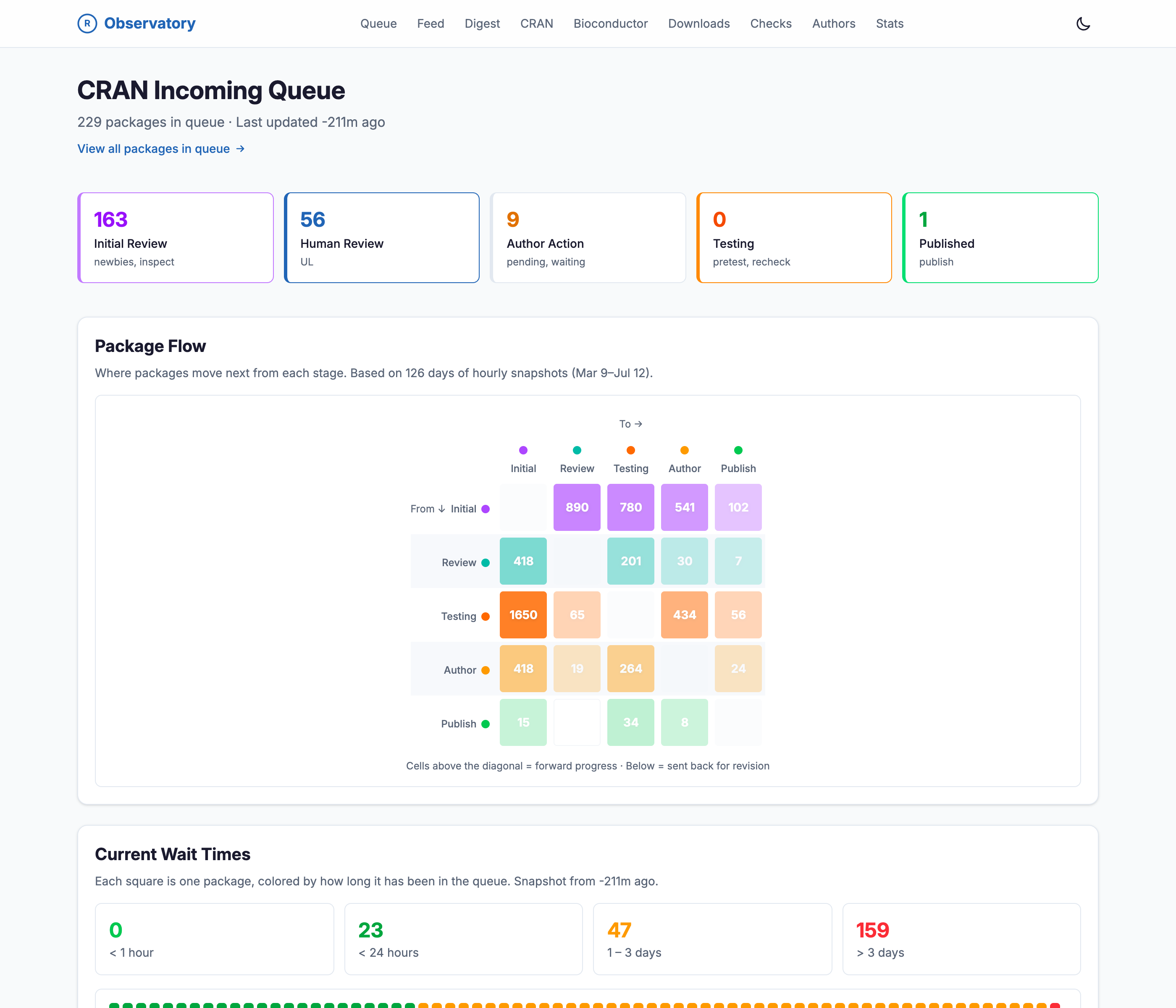
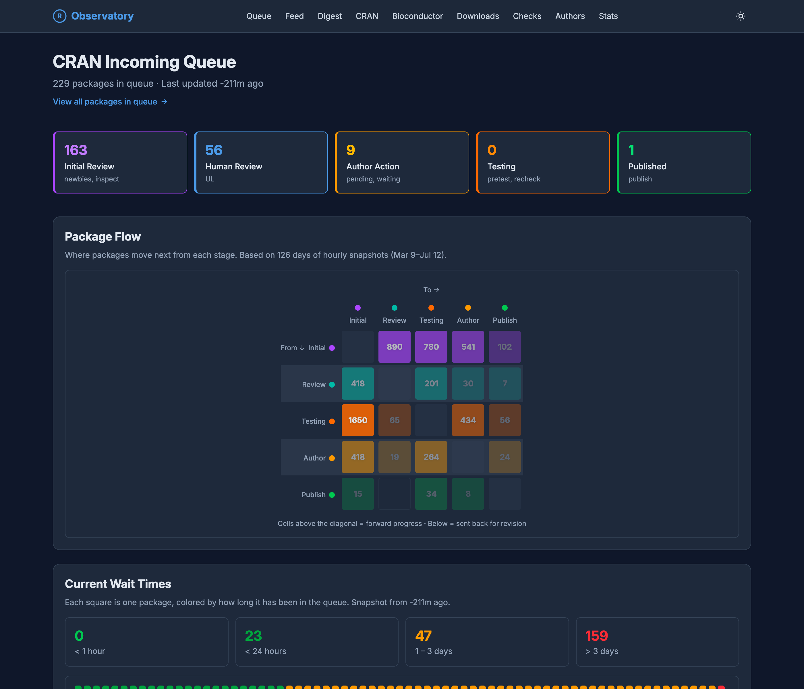
The CRAN Incoming Queue page. Stage cards across the top count 163 packages in Initial Review, 56 in Human Review, 9 awaiting Author Action, 0 in Testing, and 1 Published. A Package Flow matrix, built from 126 days of hourly snapshots, shows where packages move next from each stage, with cells above the diagonal marking forward progress and cells below marking packages sent back for revision. A Current Wait Times panel buckets packages by how long they have waited: 0 under an hour, 23 under a day, 47 one to three days, and 159 over three days.

The CRAN Incoming Queue page. Stage cards across the top count 163 packages in Initial Review, 56 in Human Review, 9 awaiting Author Action, 0 in Testing, and 1 Published. A Package Flow matrix, built from 126 days of hourly snapshots, shows where packages move next from each stage, with cells above the diagonal marking forward progress and cells below marking packages sent back for revision. A Current Wait Times panel buckets packages by how long they have waited: 0 under an hour, 23 under a day, 47 one to three days, and 159 over three days.

Figure 14: The submission queue as an analytical view: how many packages sit at each stage, where they tend to move next, and how long they have been waiting.

The queue’s deeper history is borrowed, and gladly. Those hourly snapshots have been collected for years by cransays, an r-hub project whose dashboard photographs the CRAN incoming folder every hour and keeps every frame, and it is still collecting them today. The Observatory’s earlier queue history draws on that archive, and it now takes its own hourly snapshots alongside it.

A feed streams new and updated packages as they land, and the digest turns that stream into a record: what was published, updated, and archived, summarized by month, quarter, and year, on a timeline that runs back to CRAN’s early years. It is the history made browsable, one period at a time.
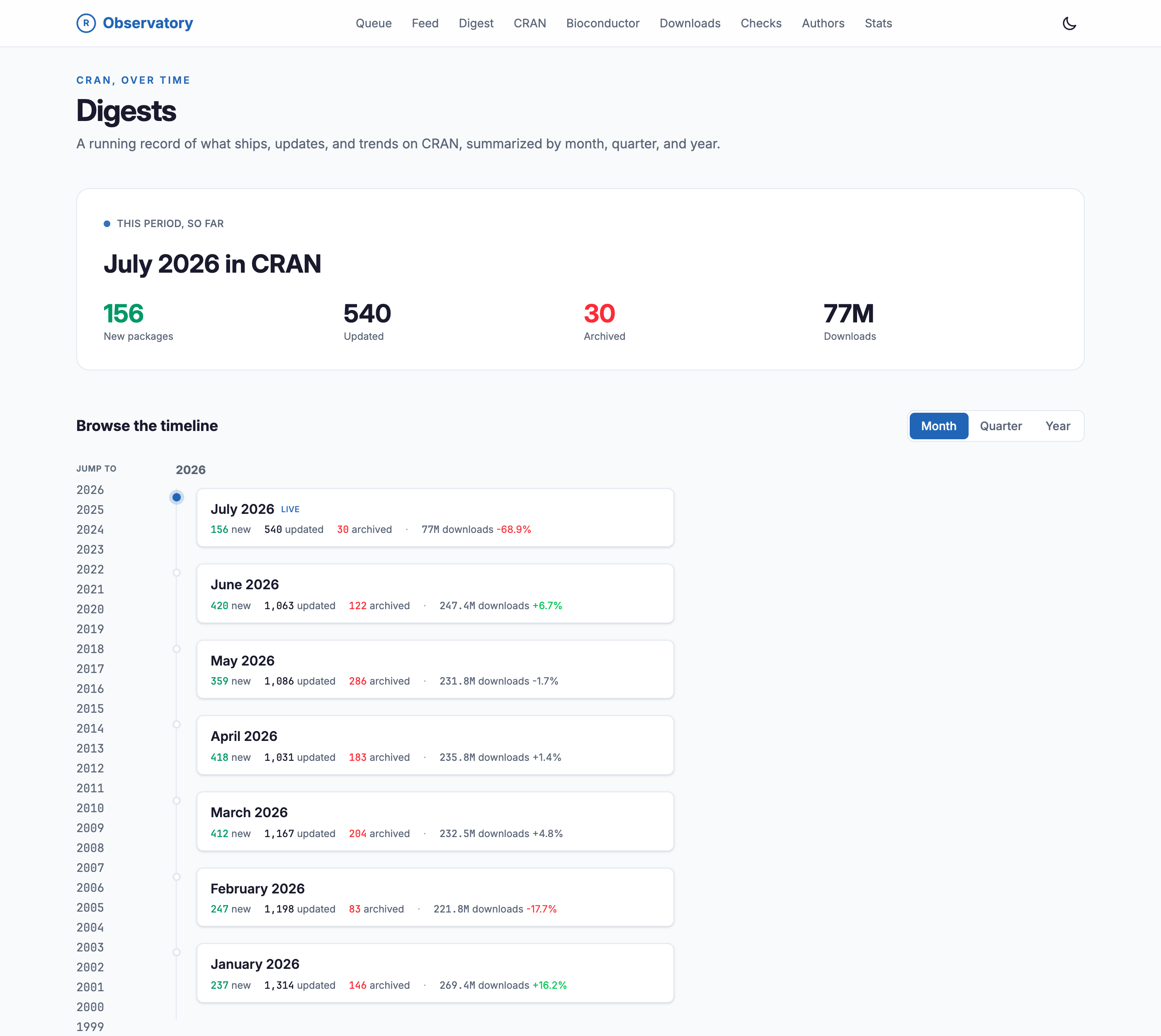
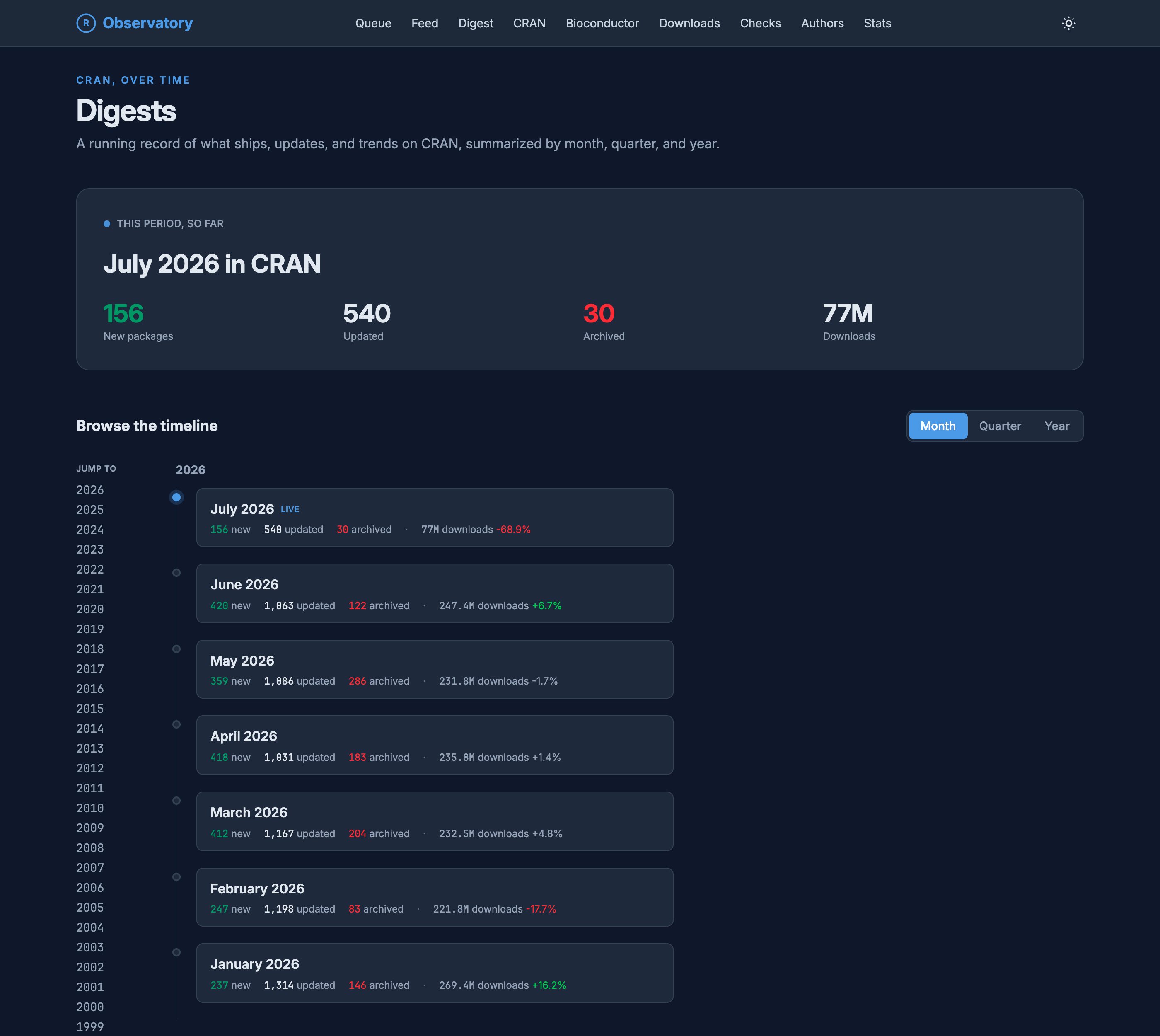
The Digests page, a running record of new, updated, and archived packages on CRAN summarized by month, quarter, and year. A this-period-so-far card for July 2026 shows 156 new packages, 540 updated, 30 archived, and 77M downloads. Below, a Month, Quarter, Year toggle and a scrollable timeline list each recent month with its new, updated, and archived counts and its download total and percentage change, beside a year jump-list running from 2026 back to 1999.

The Digests page, a running record of new, updated, and archived packages on CRAN summarized by month, quarter, and year. A this-period-so-far card for July 2026 shows 156 new packages, 540 updated, 30 archived, and 77M downloads. Below, a Month, Quarter, Year toggle and a scrollable timeline list each recent month with its new, updated, and archived counts and its download total and percentage change, beside a year jump-list running from 2026 back to 1999.

Figure 15: The digest is the ecosystem’s diary, month by month back to CRAN’s early years.

The checks view tracks CRAN check status across every test platform, but it sorts by consequence rather than alphabetically. It counts new and resolved issues over the last week, and a “packages at risk” table ranks the current failures by download impact, so a check error on a package with two million installs surfaces above one on a package nobody depends on.
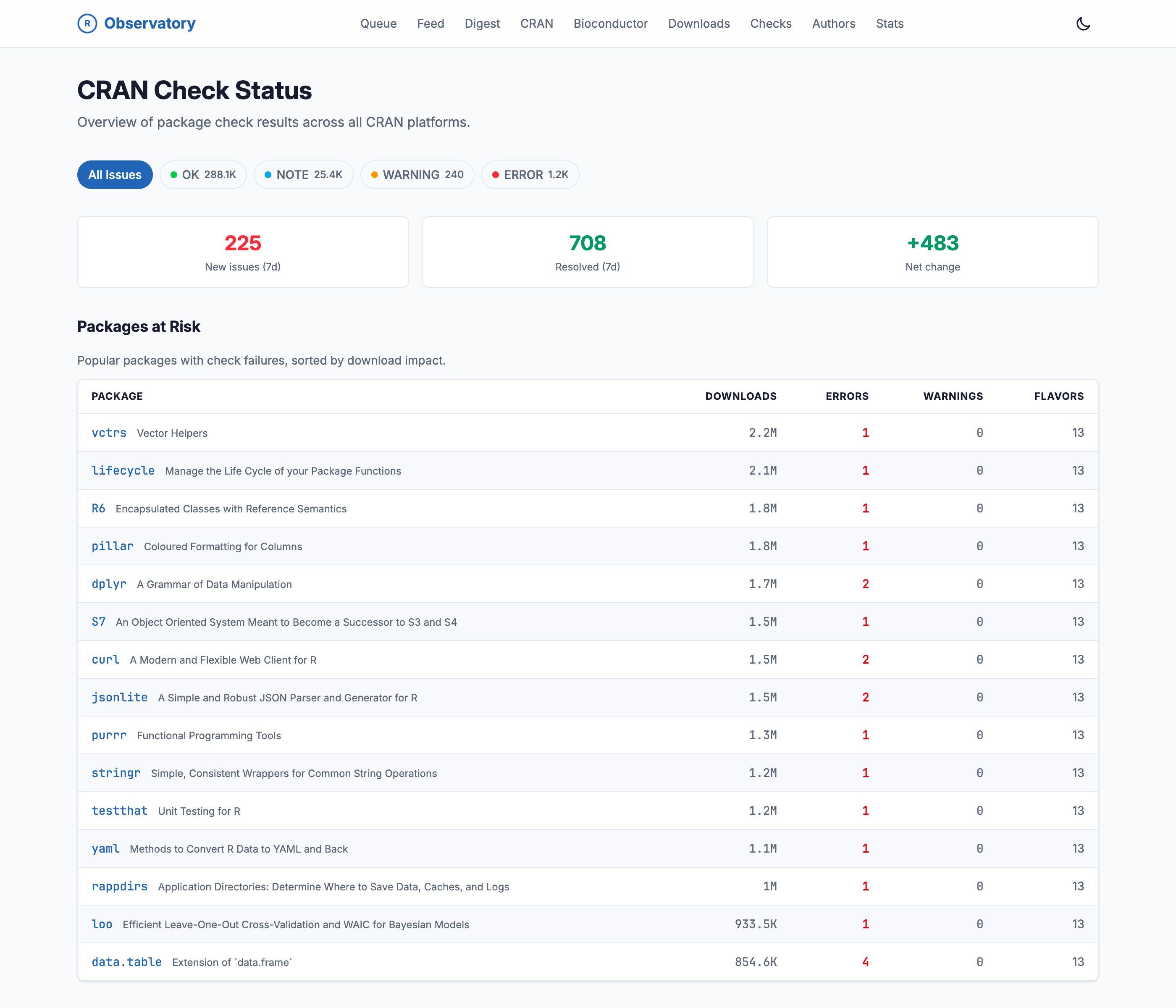
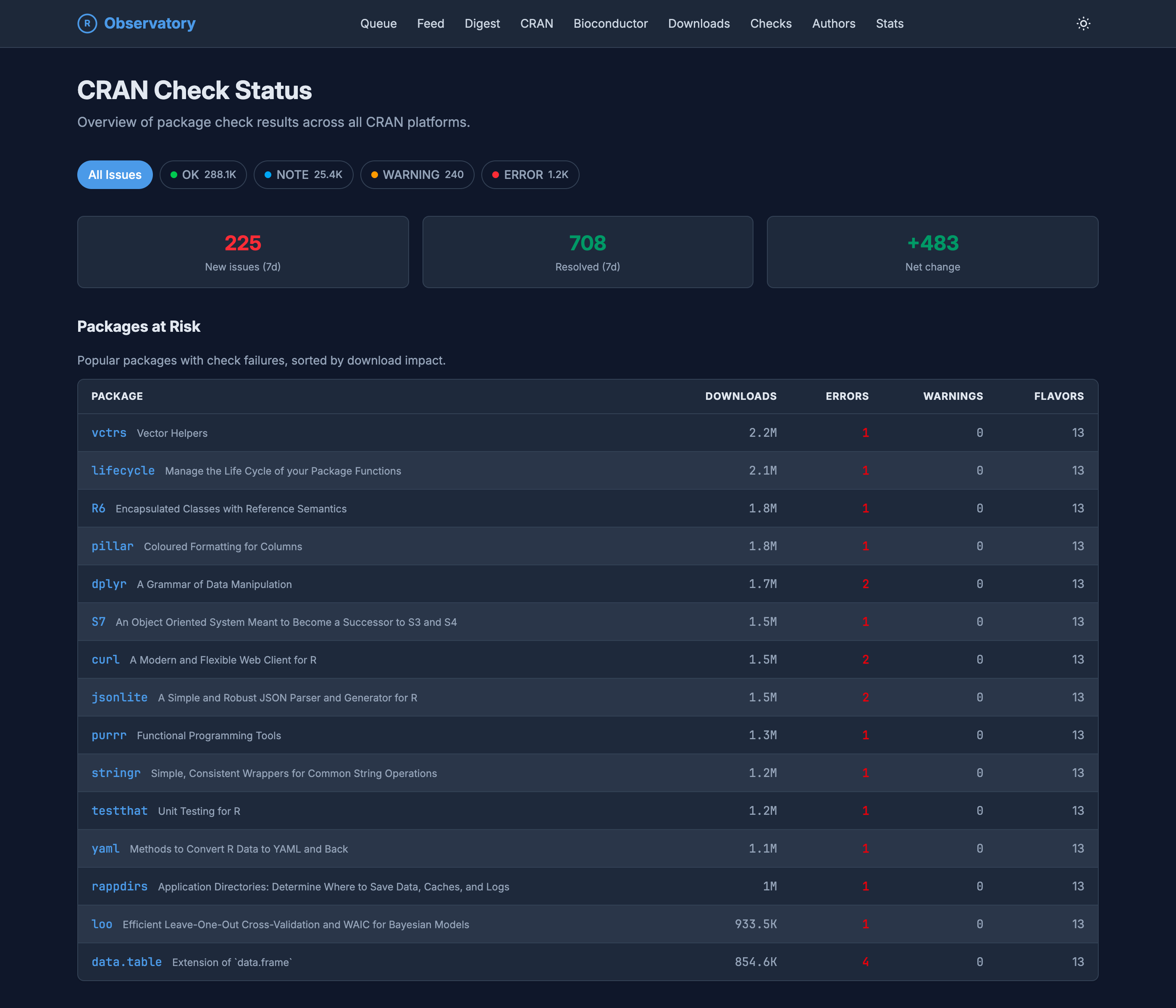
The CRAN Check Status page. Filter chips count OK 288.1K, NOTE 25.4K, WARNING 240, and ERROR 1.2K. Three cards show 225 new issues in the last 7 days, 708 resolved, and a net change of +483. A Packages at Risk table lists popular packages with check failures sorted by download impact, including vctrs, lifecycle, R6, pillar, dplyr, and data.table, each with its yearly downloads, error and warning counts, and the number of platform flavors.

The CRAN Check Status page. Filter chips count OK 288.1K, NOTE 25.4K, WARNING 240, and ERROR 1.2K. Three cards show 225 new issues in the last 7 days, 708 resolved, and a net change of +483. A Packages at Risk table lists popular packages with check failures sorted by download impact, including vctrs, lifecycle, R6, pillar, dplyr, and data.table, each with its yearly downloads, error and warning counts, and the number of platform flavors.

Figure 16: Check status ranked by impact: a failure on a package with two million downloads sits above one nobody would notice.

Packages leave, too. The archived view is the queue’s mirror image: the thousands of packages pulled from the CRAN listing over the years, each with the reason it went, whether a dependency that was archived first, a check error left unfixed, or a maintainer’s email gone dark. Those reasons, and the dates behind them, come from CRAN’s own PACKAGES.in file and its structured archival fields, which most tools never read. I owe that pointer to Rich FitzJohn and Lluís Revilla Sancho, whose writing on how and why packages get archived is what led me to it.
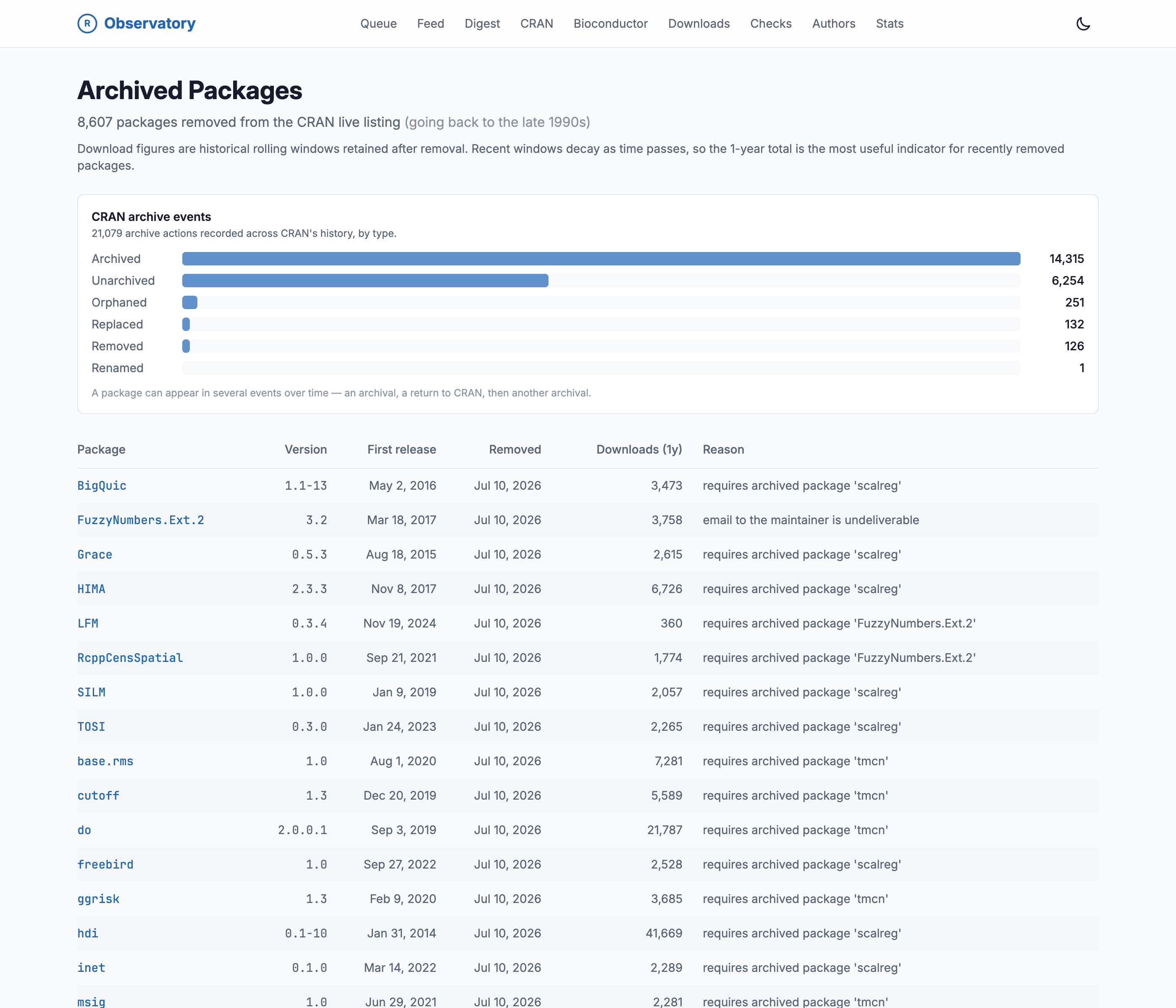
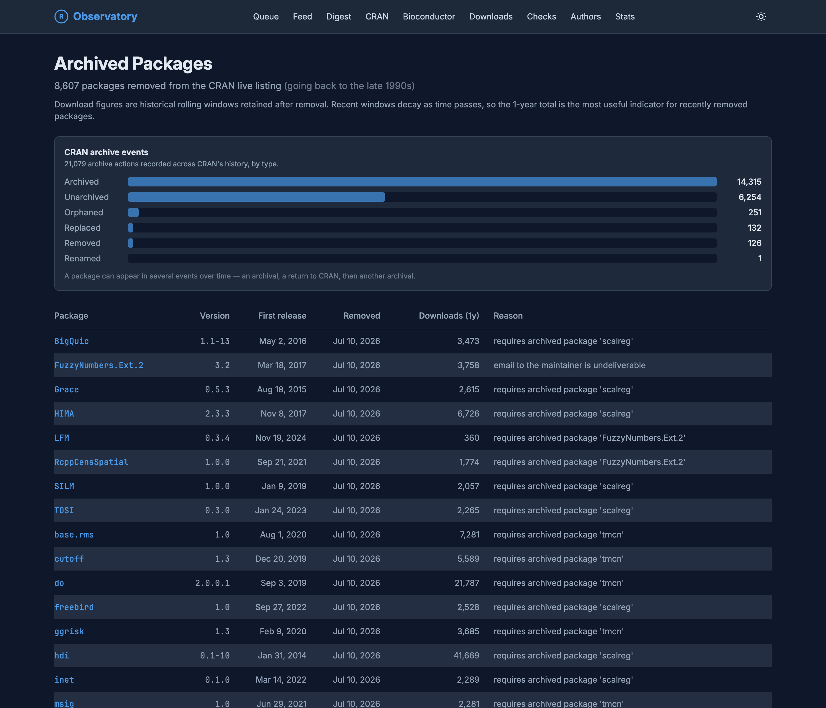
The Archived Packages page, listing 8,607 packages removed from the CRAN live listing going back to the late 1990s. A CRAN archive events panel counts 21,079 archive actions across CRAN history by type: Archived 14,315, Unarchived 6,254, Orphaned 251, Replaced 132, Removed 126, and Renamed 1. Below, a table lists archived packages with columns for version, first release date, removal date, one-year downloads, and reason, with reasons such as requires archived package scalreg and email to the maintainer is undeliverable.

The Archived Packages page, listing 8,607 packages removed from the CRAN live listing going back to the late 1990s. A CRAN archive events panel counts 21,079 archive actions across CRAN history by type: Archived 14,315, Unarchived 6,254, Orphaned 251, Replaced 132, Removed 126, and Renamed 1. Below, a table lists archived packages with columns for version, first release date, removal date, one-year downloads, and reason, with reasons such as requires archived package scalreg and email to the maintainer is undeliverable.

Figure 17: The other end of the lifecycle: over eight thousand packages that have left CRAN, back to the late 1990s, each with the reason it was removed.

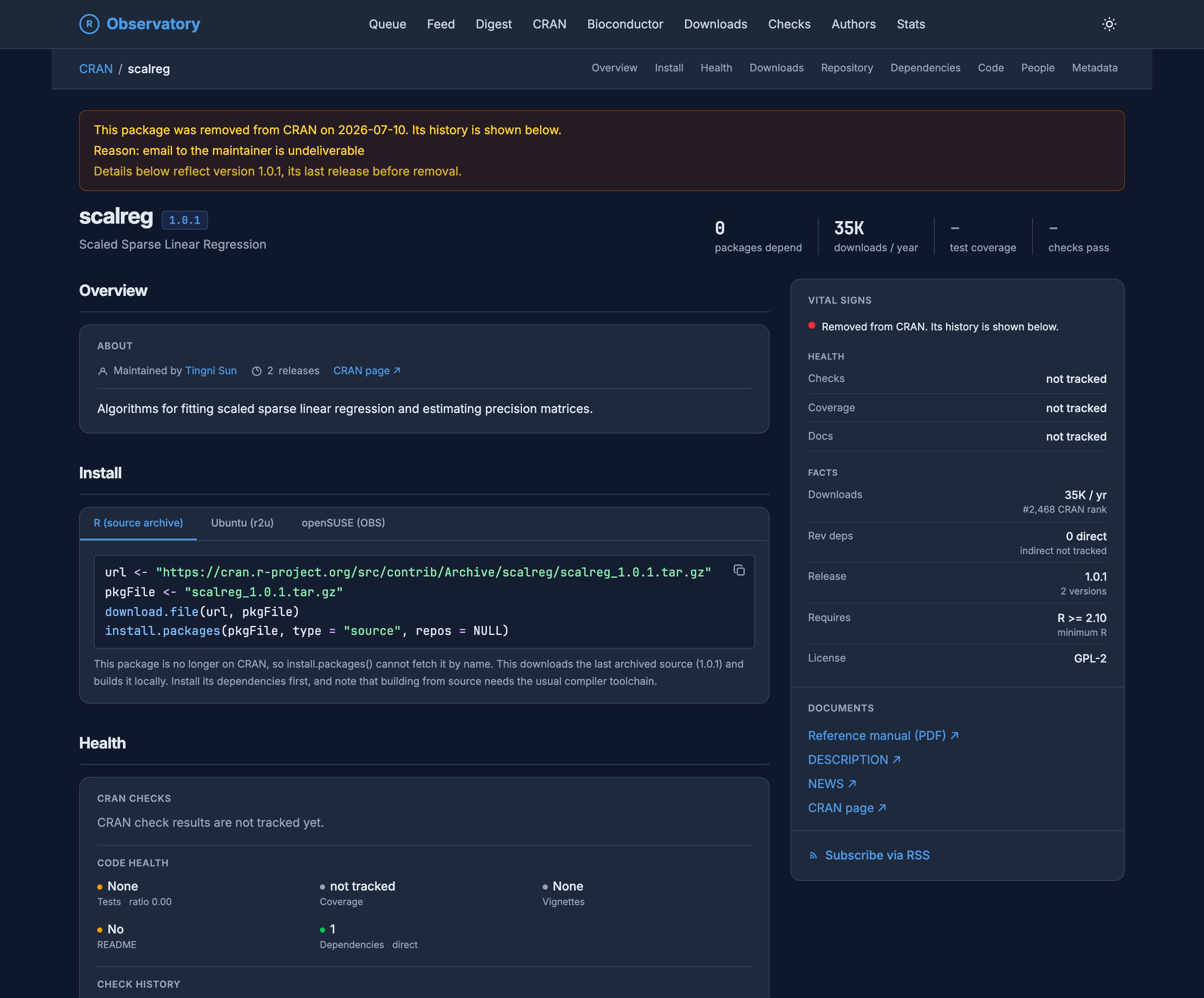
A removed package keeps its own page, too. It stays up with the archival banner across the top, the version it last released, the reason it went, and even the lines to install that final source from the CRAN archive by hand, since install.packages() can no longer fetch it by name.
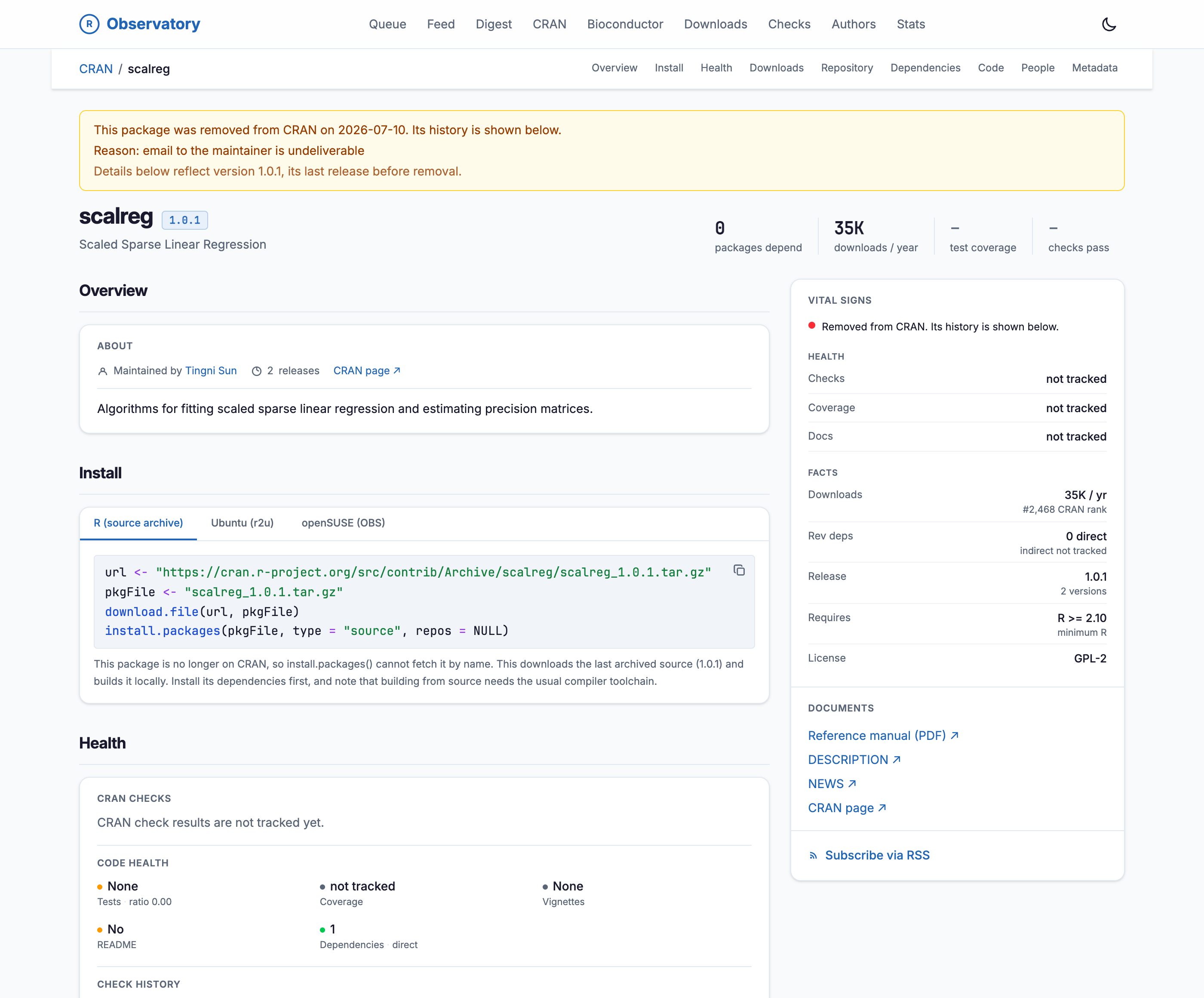
The scalreg package page on the R Observatory, marked as removed from CRAN. A banner reads that the package was removed on 2026-07-10 because email to the maintainer is undeliverable, and that the details below reflect version 1.0.1, its last release before removal. The header shows scalreg 1.0.1, Scaled Sparse Linear Regression, with fast facts of zero packages depending on it, thirty-five thousand downloads a year, and no tracked test coverage or check results. An Install panel gives R code to download and build the final archived source from the CRAN archive, noting that install.packages cannot fetch it by name. A vital-signs rail repeats that the package was removed from CRAN.

The scalreg package page on the R Observatory, marked as removed from CRAN. A banner reads that the package was removed on 2026-07-10 because email to the maintainer is undeliverable, and that the details below reflect version 1.0.1, its last release before removal. The header shows scalreg 1.0.1, Scaled Sparse Linear Regression, with fast facts of zero packages depending on it, thirty-five thousand downloads a year, and no tracked test coverage or check results. An Install panel gives R code to download and build the final archived source from the CRAN archive, noting that install.packages cannot fetch it by name. A vital-signs rail repeats that the package was removed from CRAN.

Figure 18: scalreg, removed from CRAN in July 2026 after its maintainer’s email started to bounce. The page it leaves behind stays browsable, banner and all.

The shape of the whole

For the aggregate rather than any one package, a site-wide statistics page pulls back to the ecosystem at once: how many packages are active or archived across CRAN and Bioconductor, how licenses, compiled code, and package age are spread across everything, and how the catalog has grown since 1999. Enough is live that it has already changed how I look things up.
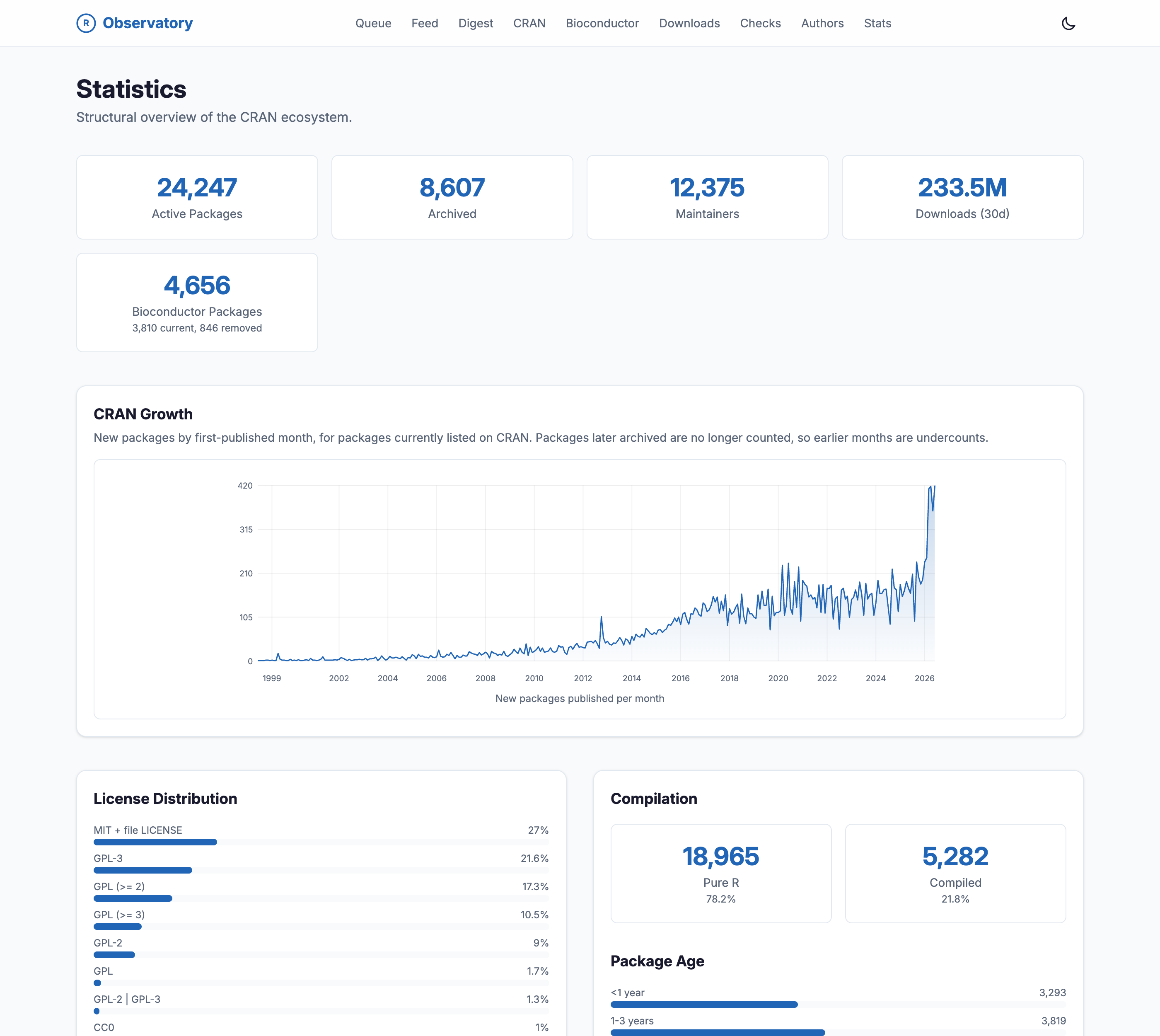
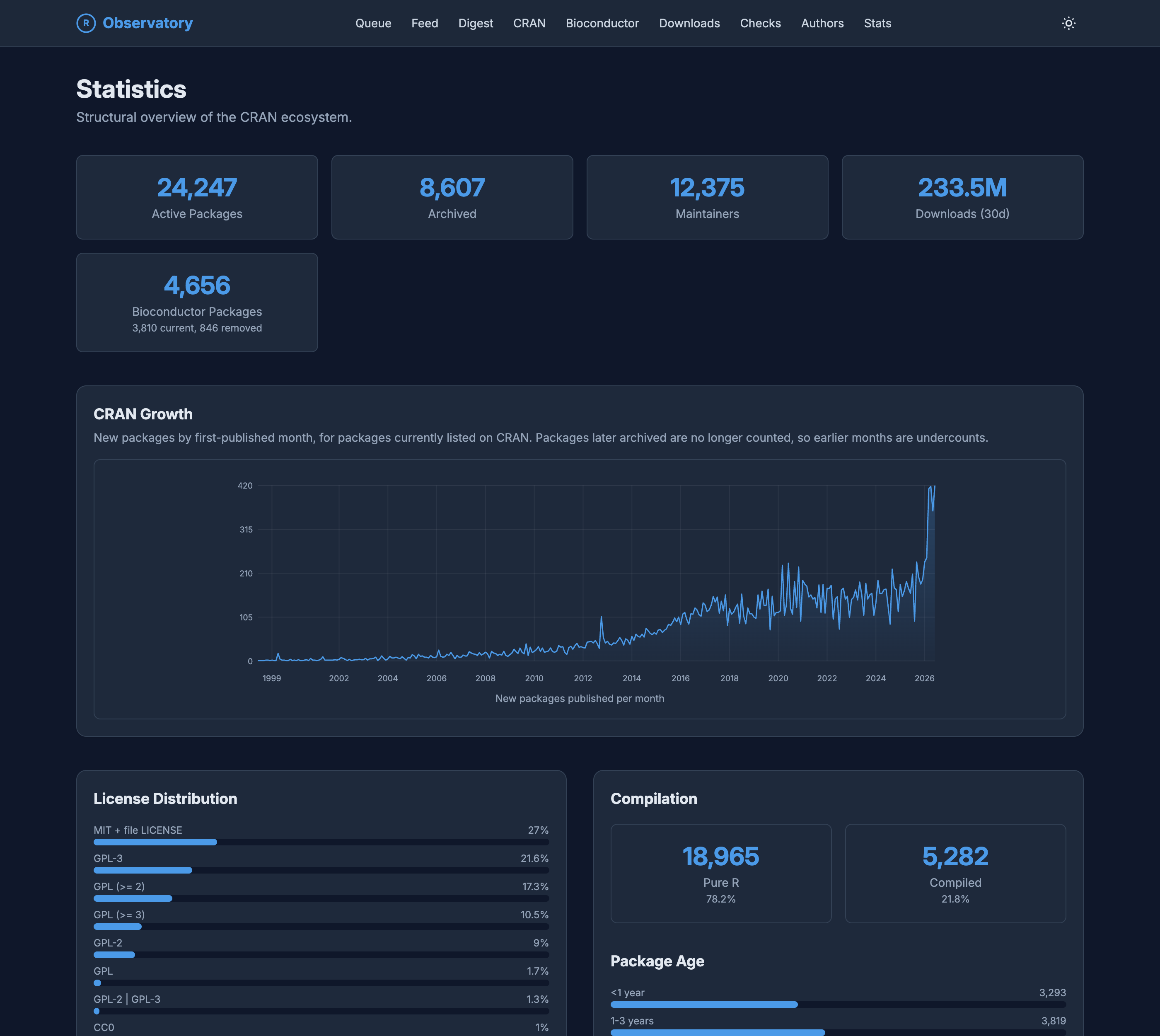
The Statistics page on the R Observatory, a structural overview of the CRAN ecosystem. Summary cards read 24,247 active packages, 8,607 archived, 12,375 maintainers, 233.5 million downloads over thirty days, and 4,656 Bioconductor packages. A CRAN Growth chart plots new packages by first-published month from 1999 to 2026, rising from near zero to over four hundred a month. Panels below break down license distribution, with MIT and GPL variants most common, a compilation split of 78 percent pure R to 22 percent compiled, and a distribution of package age.

The Statistics page on the R Observatory, a structural overview of the CRAN ecosystem. Summary cards read 24,247 active packages, 8,607 archived, 12,375 maintainers, 233.5 million downloads over thirty days, and 4,656 Bioconductor packages. A CRAN Growth chart plots new packages by first-published month from 1999 to 2026, rising from near zero to over four hundred a month. Panels below break down license distribution, with MIT and GPL variants most common, a compilation split of 78 percent pure R to 22 percent compiled, and a distribution of package age.

Figure 19: A structural overview of the ecosystem: active and archived counts, CRAN’s monthly growth since 1999, and the spread of licenses, compiled code, and package age.

Find, build, observe

The moment you look at R packages beyond CRAN’s own pages, you meet a crowded field of tools. The Observatory sits off to one side of all of them, because it is not trying to do what they do.
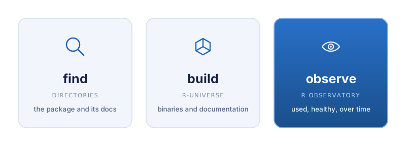
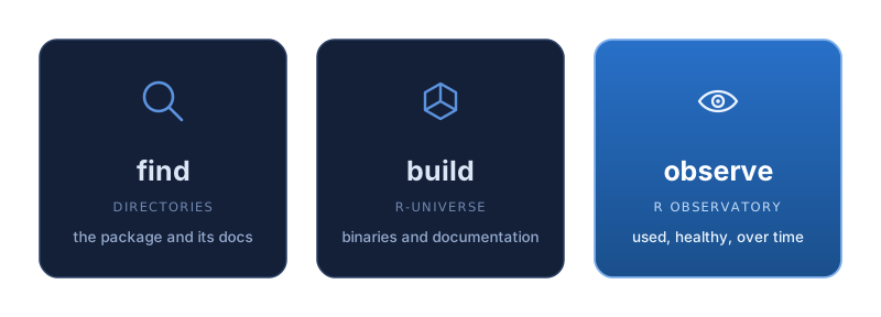
A three-panel diagram contrasting three roles. Find, for directories, with a magnifier icon and the note 'the package and its docs.' Build, for r-universe, with a cube icon and the note 'binaries and documentation.' Observe, for the R Observatory, highlighted in brand blue with an eye icon and the note 'how used, how healthy, over time.'

A three-panel diagram contrasting three roles. Find, for directories, with a magnifier icon and the note 'the package and its docs.' Build, for r-universe, with a cube icon and the note 'binaries and documentation.' Observe, for the R Observatory, highlighted in brand blue with an eye icon and the note 'how used, how healthy, over time.'

Figure 20: Directories find a package, r-universe builds it, the Observatory observes it. Only the last is a job done over time.

Most of that field is about finding and reading packages. METACRAN, at r-pkg.org, is a search engine and a metadata API. RDocumentation, rdrr.io, and r-packages.io index and reformat package documentation so you can read a package without installing it. They answer “find me the package and its docs.” R-universe, from rOpenSci, is a different kind of thing: a build-and-serve platform that compiles binaries across Windows, macOS, Linux, and WebAssembly, renders documentation, produces badges, and gives every package a landing page. It answers “how do I build and document my packages.”

The Observatory does not build, host, or catalog. It watches and keeps the record: how a package is installed across every channel rather than one mirror, how its code changes from one version to the next, and how the whole ecosystem moves from one day to the next. Where the directories answer “find it” and r-universe answers “build it,” the Observatory answers “what is happening across the ecosystem, and how used and how healthy is any given package, watched over time.” They are complementary, and I use all of them.

It also leans on the neighbors’ plumbing, and owes METACRAN a particular debt. METACRAN maintains a read-only GitHub mirror of every CRAN package, with a tag for each released version, and that mirror is the raw material the Observatory walks backward through to compute per-version metrics and the version diffs. Without it the diffs would mean re-fetching every tarball by hand. The Observatory borrows a directory’s mirror, then measures what a directory never set out to measure.

A constellation of pipelines

None of this began as a plan for an observatory. It started in February 2026 with a single pipeline and the first of those frustrations: a wish to see, concretely, what was moving across the two repositories. The first public pieces went up that March, around the time I put the R mailing list archives online as a separate project. Answering even a piece of it well meant scraping one channel, then another, then most of them. Measuring one package’s code turned into a per-version pass over all of them. Each new signal, the feed, the queue, the check history, the datasets, the co-authorship graph, started as its own small job built to make one specific thing visible.

The architecture is a direct consequence of that order of events, and it is most of why the whole thing stays maintainable by one person. Each data stream is its own small pipeline, a separate repository under the r-observatory organization, and each does exactly one job. A pipeline runs on a schedule and publishes its output not to a database server but as a plain SQLite file attached to a dated GitHub release. Those releases are immutable, so each day’s data stays exactly as it was, and the history is preserved by construction rather than by remembering to back anything up. A merge step stitches the current release of each pipeline into one combined database, and the website reads that. Because every input is a self-contained, versioned file, a pipeline can fail, or be rewritten, or be added, without the others noticing, and you can always point at the exact release that produced a given number. It is less a monolith than a constellation of small, independent observers that happen to publish to the same sky.
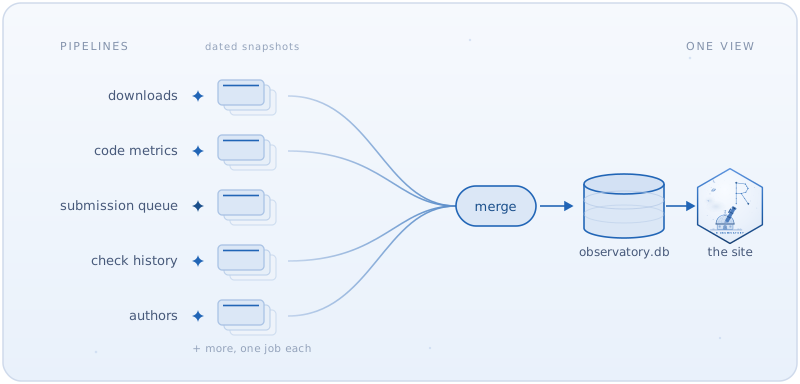
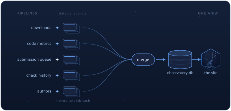
A diagram of the architecture. Five small pipelines (downloads, code metrics, submission queue, check history, authors), each drawn as an observer star publishing a stack of dated snapshots, with lines converging through a merge step into one database, observatory.db, which then feeds the site.

A diagram of the architecture. Five small pipelines (downloads, code metrics, submission queue, check history, authors), each drawn as an observer star publishing a stack of dated snapshots, with lines converging through a merge step into one database, observatory.db, which then feeds the site.

Figure 21: Each pipeline does one job and publishes dated, immutable snapshots. A merge step folds the current one from each into observatory.db, which the site reads.

There is a happy side effect to building it this way: the data is already open. Every number on the site traces back to one of those plain SQLite files on a public GitHub release, and nothing stops you from downloading them and working with them however you like, in R or anywhere else. There is no API to call, by design; the versioned, immutable files are the interface, and they will outlast any endpoint I could promise to keep running. Think of it as a small gift back to the R community, which wrote the packages all of this is watching in the first place.

How current the data is

Each of those pipelines is only as trustworthy as its last successful run, so the freshness page lays them out side by side: when each last ran, when it last changed the underlying data, how far that data now reaches, and whether it counts as current, slow, or stale. When something upstream stalls, this is where it surfaces first.
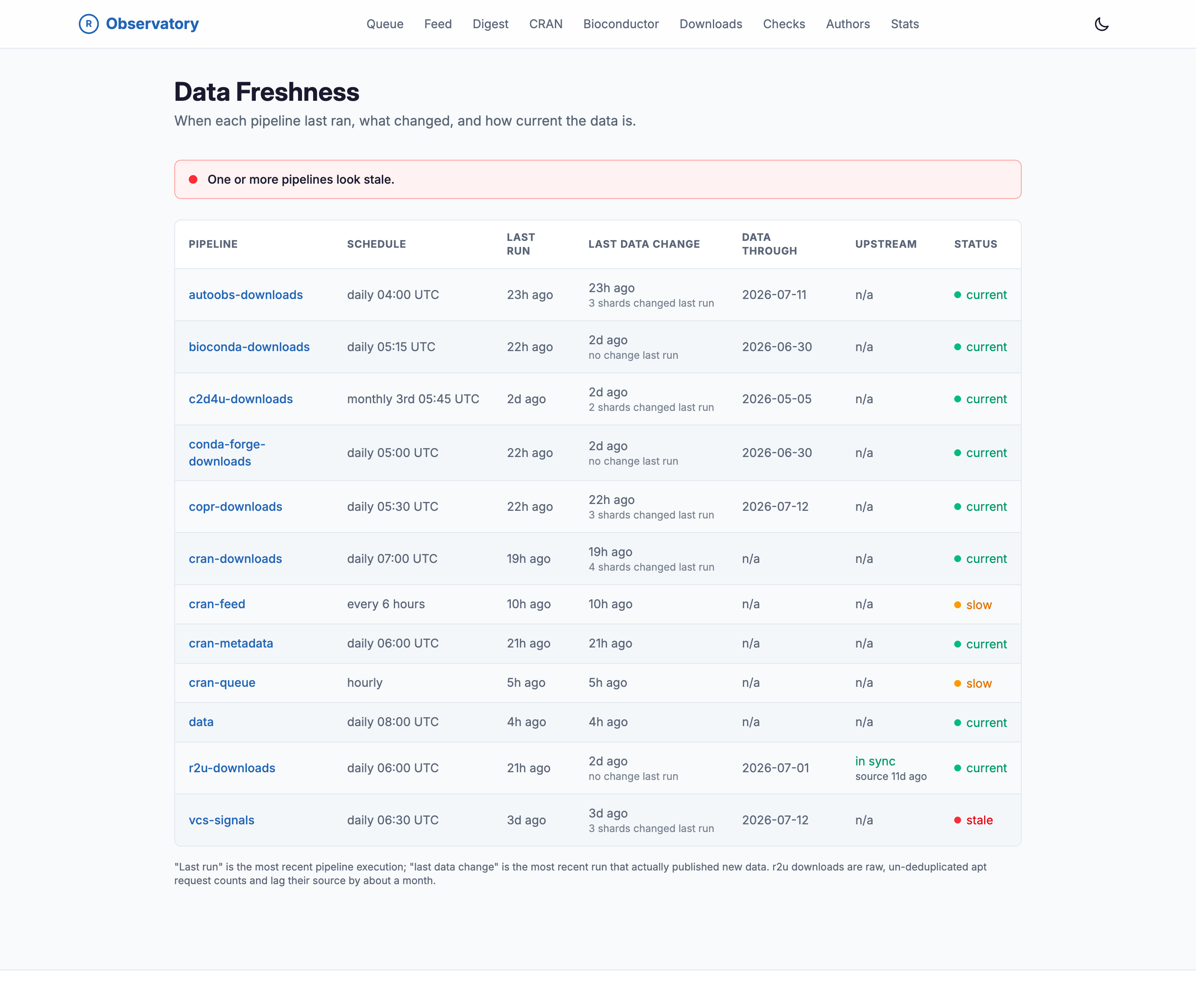
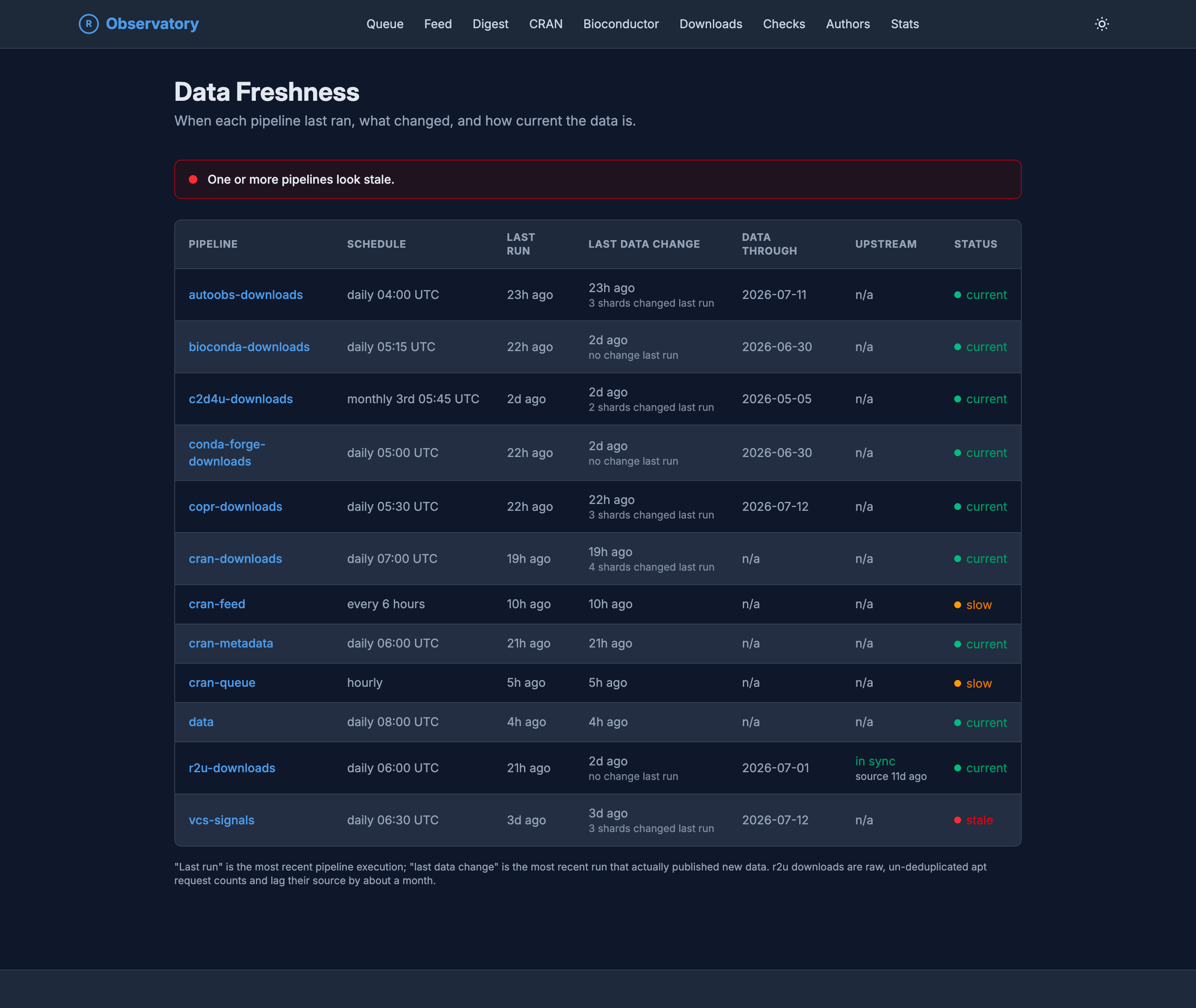
The Data Freshness page on the R Observatory, a table of every data pipeline with columns for schedule, last run, last data change, data through, upstream, and status. Rows include autoobs-downloads, bioconda-downloads, c2d4u-downloads, conda-forge-downloads, copr-downloads, cran-downloads, cran-feed, cran-metadata, cran-queue, data, r2u-downloads, and vcs-signals, each marked current, slow, or stale. A banner at the top warns that one or more pipelines look stale.

The Data Freshness page on the R Observatory, a table of every data pipeline with columns for schedule, last run, last data change, data through, upstream, and status. Rows include autoobs-downloads, bioconda-downloads, c2d4u-downloads, conda-forge-downloads, copr-downloads, cran-downloads, cran-feed, cran-metadata, cran-queue, data, r2u-downloads, and vcs-signals, each marked current, slow, or stale. A banner at the top warns that one or more pipelines look stale.

Figure 22: Each pipeline’s schedule, last run, and reach, with a plain current, slow, or stale verdict on every row and a warning up top when any of them fall behind.

On the ads

You will see ads on the Observatory, and I would rather be upfront about why. The site does a lot of work: it scrapes many download sources on a schedule, computes per-version code metrics over the whole archive, and stores the history so none of it has to be recomputed. That is compute, storage, and bandwidth, and the site is free, with no account, no paywall, and nothing sold about whoever is reading it. The ads offset the running cost so it can stay that way, and they are kept out of the path of the data.

The settings are turned down as far as AdSense allows, the fewest units it permits (six) and the widest spacing between them (1,000 pixels). Even so, its automatic placement is not always ideal, so if an ad lands somewhere it should not, let me know.

If you run an ad blocker, the site works fine. Every screenshot in this post was taken with one. And if the project ever outgrows what display ads can cover, sponsorship would be a happier answer. The other route would be to put it behind accounts and a subscription, the way pepy.tech and some of the Python download sites do, but I would rather keep it free and open. For now it is one person keeping the lights on for something that is expensive to run and free to use.

The rough edges

None of this is done. Some pipelines are still backfilling history, so a few longitudinal views are shorter than they will be. A couple of download sources are wired up but not yet counted. The design is very much still moving. It is an observatory in the literal sense: a place to watch from, built out one instrument at a time.

Fin

The thread through all of it is observation. CRAN and Bioconductor tell you a package exists, and, if you go digging, a little about its latest release. The Observatory tries to answer the questions behind that: how much a package is really used across every channel, how healthy its code is, what changed between its last two releases, who wrote it, and how the two repositories move week to week. It already answers questions I had gotten used to giving up on.

It lives at r-observatory.thecoatlessprofessor.com, and the pipelines that feed it are open on GitHub. If you maintain a package, go look at its page, diff your last two releases, and see what its call graph looks like in red and green. If the multi-channel download picture, the version-by-version code view, or a Bioconductor package’s release lineage surprises you, that surprise is the point.