
The hard part of teaching R is almost never the arithmetic. Anyone can add two numbers. The trouble starts the first time you ask someone to reach into a structure and pull a single value back out.
You write x[3] on the board. They nod. Then they try it on their own data and freeze, because x[3] is a sentence in a language whose nouns they cannot see. To you, x is a row of boxes and the third box is right there. To them, x is a word. You cannot index what you cannot picture. The bracket is the easy part; the shape it reaches into is the whole lesson, and the shape is exactly the thing a printout of numbers hides.
paintr draws the shape. Point it at a vector and it draws a row of boxes. Point it at a data frame and it draws a stack of columns that happen to line up. Point it at an array and it draws a pile of matrices. That alone would make a decent chalkboard. But paintr does one more thing, and it is the whole point of the package: on each cell, it writes the code you would type to reach that value. The label on the third box is [3], because x[3] is how you get it. The drawing and the accessor are the same statement.
The label is the accessor
Everything else follows from that one move. The picture is not a decoration that sits next to the code; it is the code, laid out in space. Once you believe that, the design decisions stop being cosmetic and start being claims about the language.
Take a named vector. A lot of teaching material draws the names on the cells and stops there, as if the name were the address. It isn’t. The address is x["mon"], brackets and quotes and all, and paintr labels each cell with exactly that, not a bare mon. The difference between mon and ["mon"] is the difference between pointing at a thing and knowing how to fetch it, and that difference is the entire skill you are trying to teach.
library(paintr)

visits <- c(mon = 5, tue = 3, wed = 8, thu = 6, fri = 2)

paint_vector(visits, layout = "horizontal")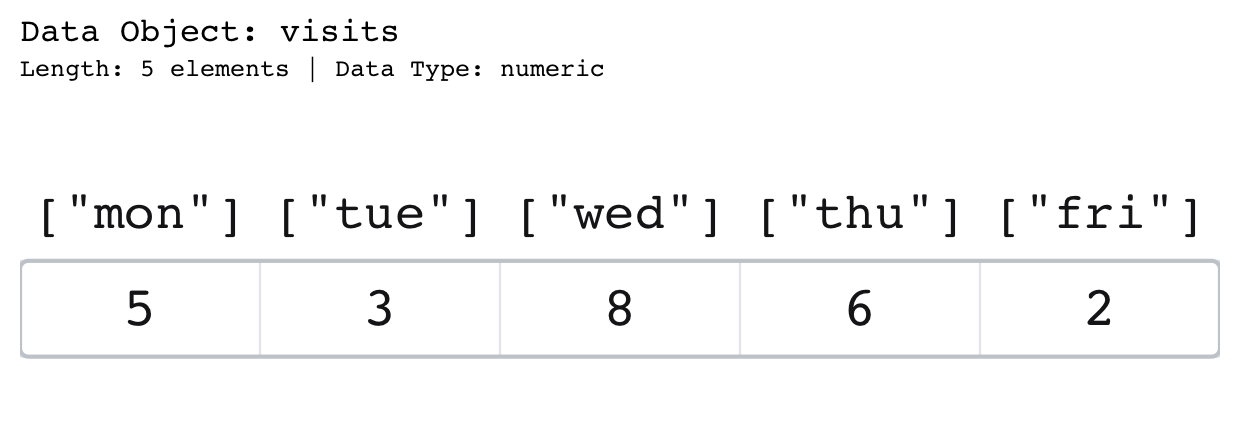
paintr labels each cell with the accessor ["mon"] rather than the bare name mon, since that is the exact code that returns the value.Five shapes, one idea
R has a handful of core structures, and each one is a different arrangement of the same boxes. paintr gives each its own painter, and every painter tells the accessor the same way.
A vector is a row of boxes addressed by position. A matrix is a grid addressed by two numbers at once, and this is where the accessor really earns its keep. Ask for show_indices = "cell" and every square gets its own [row, column] stamped inside it. Suddenly m[2, 4] is not an incantation; it is the cell you can put a finger on, second row down, fourth column across. The dimension names, when the matrix has them, print out in the margins where they belong, so the grid stays a grid.
A data frame is the workhorse, and paintr draws it the way you actually read one: a header of column names, a thin type band underneath (<dbl>, <chr>, <lgl>), and a row-name gutter down the left, but only when the row names carry meaning. mtcars earns a gutter, because its row names are car models; iris, whose rows are numbered 1, 2, 3, does not, because a gutter of integers is just noise. (paint_df() is there for the typing-averse.)
And a list is where a slogan does more work than a paragraph could:
A data frame is a list whose elements happen to share a length.
You can say that in words all day and watch it not land. Or you can draw the same two columns twice, once as a data frame and once as a list, and let the two pictures close into the same rectangle. The sentence becomes a thing you can see.
frame   <- data.frame(a = 1:3, b = 4:6)
columns <- list(a = 1:3, b = 4:6)

paint_data_frame(frame)
paint_list(columns)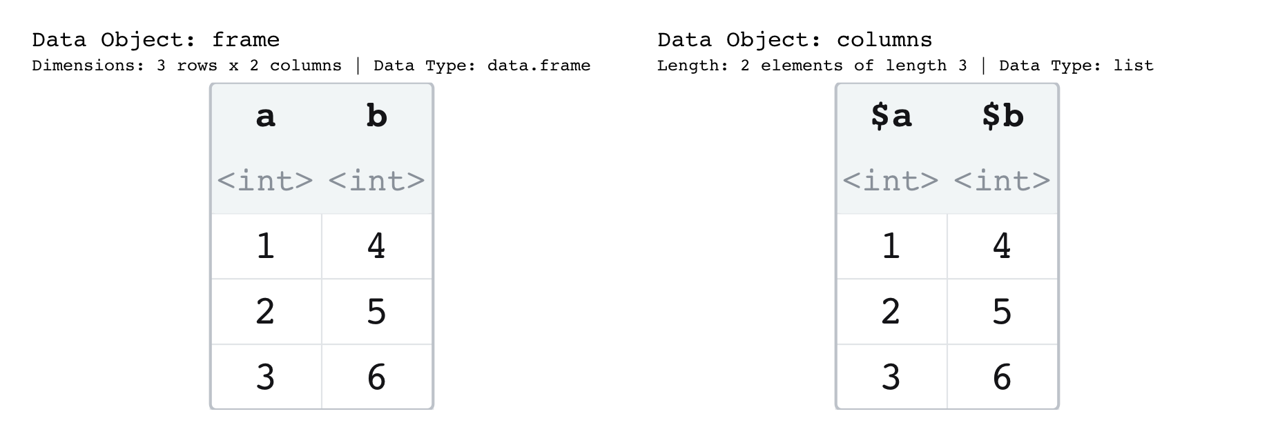
Now break one element’s length and watch what the drawing does. The elements no longer line up, so there is no rectangle to draw, and paintr withholds the enclosing border entirely; the block is left with a ragged bottom edge. That absence is not a rendering gap. The border appears exactly when the elements share a length, and a ragged block gets none. That is the difference between a list and a data frame, drawn literally. A rectangular list is one border away from a data frame; a ragged one is a list and nothing else. The rectangle closing is the lesson, not decoration on it.
bundle <- list(a = 1:3, b = 4:7, c = 8:9)

paint_list(bundle)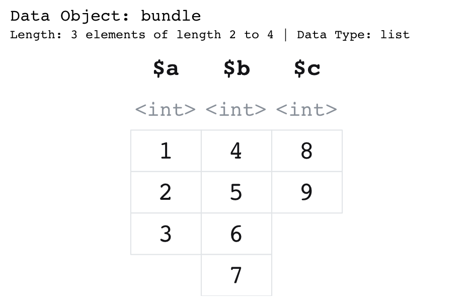
The accessors keep pace with all of this. A named list element is labelled $a; an unnamed one is [[2]], the double bracket that pulls the element out rather than the single bracket that keeps it wrapped in a list. Ask for show_indices = "cell" and each value gets its full l[[j]][i] accessor printed right on it, and the single-versus-double-bracket confusion, the one that outlives every other beginner mistake, simply resolves. A nested list is not redrawn as more boxes, that way lies an unreadable fractal, but shown as a calm grey <list [2]>, a placeholder that says “there is more structure here, one level down.”
The last shape gets its own slogan too:
An array is a stack of matrices.
paint_array() takes that literally and lays the stack out as a row of blocks, each titled , , 1, , , 2, the way print() heads its slices, all sharing one font size so no slice looks more important than another. Stacks get tall fast, so slices_per_row wraps them into a grid; the blocks stay large and legible instead of shrinking into one cramped strip. And every cell carries its full [i, j, k] subscript, so the three-index address that reads like abstract nonsense on the page becomes a specific box in a specific slice.
block <- array(1:24, dim = c(2, 3, 4))

paint_array(block, slices_per_row = 2, show_indices = "cell")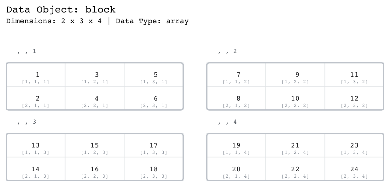
2 x 3 x 4 array drawn as what it really is, a stack of four matrices wrapped two per row so the slices stay legible. Each cell carries its full [i, j, k] address.Built to be read
Every choice about what a cell shows serves the same goal, that a learner can read the structure straight off the page. Numbers print at three significant figures, with the digits paintr sets aside greyed rather than dropped, so 123456.789 draws as a black 123 followed by a faded 457. and the magnitude of the value stays in view while the noise steps back. Colour is doing the same quiet work, with black for a value, red for NA, blue for Inf or NaN, and grey for the digits that do not matter, so a missing value looks missing and an infinity reads like the edge of the number line rather than a typo. Character values render as themselves, and every cell’s contents are fitted to the space so nothing spills past its own border.
readings <- c(123456.789, 3.14159, 1000, NA, Inf, NaN)

paint_vector(readings, layout = "horizontal")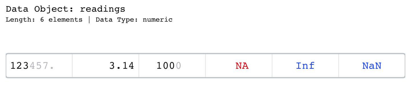
123456.789 keeps its magnitude as a black 123 and a greyed 457., 1000 greys its insignificant trailing 0, NA draws red, and Inf and NaN draw blue.When a structure grows too big to draw in full it shows its head, a single row of ..., and its tail, with a quiet # 130 more rows note underneath so you always know what was folded away. And because the point of a picture is to be pointed at, highlight_rows(), highlight_columns(), and highlight_locations() shade the cells you name, turning “find the rows where mpg > 30” into a picture with the answer lit up inside it.
cars <- data.frame(mpg = c(21, 33.9, 22.8, 30.4, 15.5), cyl = c(6, 4, 4, 4, 8))

paint_data_frame(cars, highlight_area = highlight_rows(cars, cars$mpg > 30))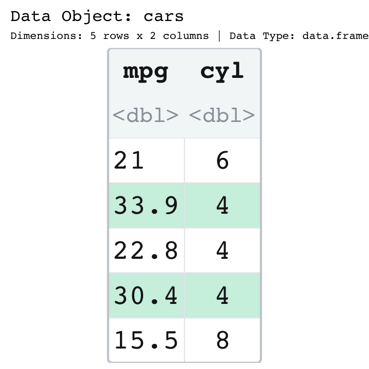
highlight_rows() shades the rows you name. Here the two cars with mpg over 30 are lit up, so the answer to the question is the part of the picture that glows.For the person making the figure rather than the one reading it, paint_size() reports how large a device a structure needs to stay legible, as c(width, height) in inches, centimetres, or pixels, and because it opens no device to work it out, it answers before you have one that is too small:
paint_size(mtcars, units = "in")
#> width height
#>   4.4   2.4
Paste those two numbers into a png() call or a knitr chunk header and the picture arrives the right size on the first try, instead of after three rounds of squinting and re-rendering.
Two backends, one picture
paintr hands you the drawing in whichever form your workflow wants, and the two forms are the same picture down to the pixel.
paint_vector(c(4, 8, 15, 16, 23, 42))   # base graphics, straight to the device
gpaint_vector(c(4, 8, 15, 16, 23, 42))  # a real ggplot object you can print or ggsave
The paint_*() family draws in base graphics, right onto the current device, which is perfect for a live demo or a quick look in the console. The gpaint_*() family returns an actual ggplot2 object, so you can ggsave() it, restyle its chrome, or drop it into a patchwork beside a real plot of the same data. Same diagram, two doors in.
The refined look
The newest thing in paintr, and the part that surprised me most in how much it matters, is that these pictures now look like something you would actually want to put in front of a class.
Every painter takes a palette argument with four choices. "mint" is the new default, joined by "slate" and "warm", and the original flat black-grid look lives on as "classic". The three modern palettes share a refined card: a tinted header band, bold column names sitting over lighter type tags, hairline borders instead of a hard black grid, and softly rounded corners. The result reads less like a debug dump and more like a diagram, which is the whole point when the picture is the lesson.
paint_data_frame(head(mtcars[, 1:4]), palette = "mint")     # the new default
paint_data_frame(head(mtcars[, 1:4]), palette = "slate")
paint_data_frame(head(mtcars[, 1:4]), palette = "warm")
paint_data_frame(head(mtcars[, 1:4]), palette = "classic")  # the original look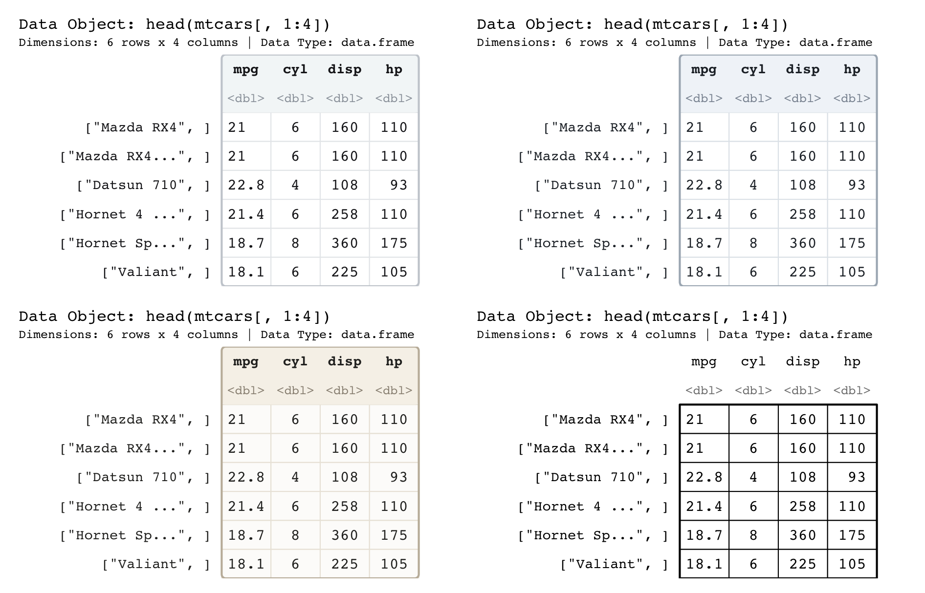
"mint", "slate", and "warm" share the refined card (tinted header, hairline borders, rounded corners), while "classic" keeps the original flat black grid.The style is not baked into either renderer. It rides along as data on the cell table, which is why the base backend and the ggplot backend draw it identically. Neither one owns the look; they both just read it off the same object.
A picture, not a plot
paintr is not a plotting library, and it is not trying to be. You would never reach for it to visualize your findings; it sits one step earlier, in the moment when someone still needs to see what an object is before they can do anything with it. R’s usual tools for that moment describe the object rather than draw it: str() narrates its shape, print() spells the values out, and View() opens a spreadsheet you can scroll. The tools that do draw R data are pointed elsewhere: Garrick Aden-Buie’s tidyexplain and Microsoft’s datamations animate what the tidyverse verbs do to a data frame, and lobstr diagrams an object’s internals as a tree. paintr draws the object itself, at rest, and writes on each cell the code that reaches into it, across all five structures, so the picture and the accessor are the same thing.
That is the whole ambition. Get the picture and the accessor to be the same object, and indexing stops being a spell and becomes a thing you can watch yourself do. The drawing teaches the reading, because the drawing is the reading.
Installation
paintr is headed to CRAN. Until it lands there, install the development version from GitHub with pak:
# install.packages("pak")
pak::pak("coatless-rpkg/paintr")
Once it is accepted, the usual line will do:
install.packages("paintr")A note on the name, for anyone who followed the early work. paintr grew up under the name drawr, but CRAN does not allow two package names that differ only in case, and DRaWR already held that spot, so a rename it was. The pictures never changed, only the label on the box, which, for a package about labels, feels about right.
References
Every external link used above, gathered in one place: